The Real Reason Waffle Houses Are So Small
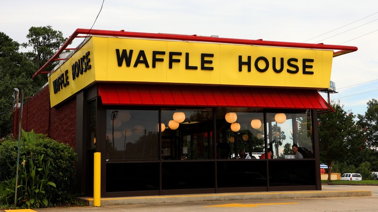
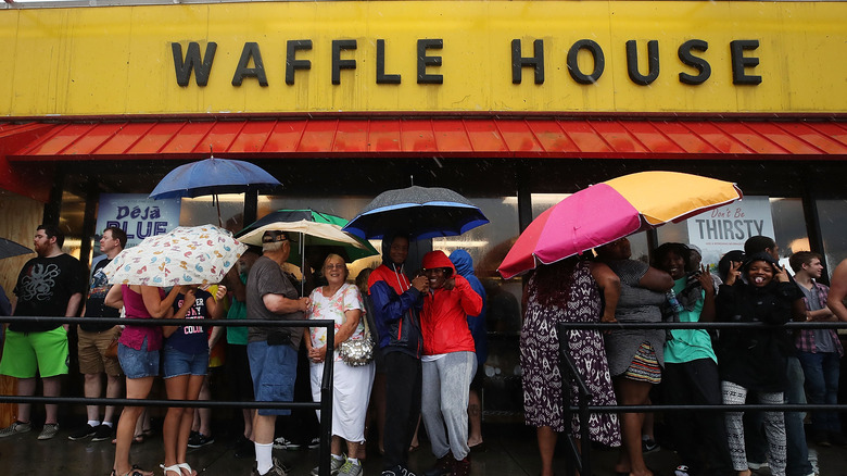
If you've ever been to Waffle House on a Sunday morning in search of a quick fix for a mean hangover, you may have fallen victim to their long wait times and over-crowded entryway — the last thing you need with a ringing headache and an empty stomach. Even if you can grab a seat at the bar, the stools are placed in extremely close proximity to one another. But frankly, that's just the way of Waffle House. Their restaurant's design, despite its minor inconveniences, is iconic and recognizable — a small glass rectangle trimmed with red and yellow and topped by a flat roof.
A familiar fixture to most Americans — the Waffle House architecture is by design. In an AJC interview with the breakfast chain's spokesman Pat Warner, he says its shoebox design is a result of commercial real estate ordinances in the 1960s that based land costs on how much of the storefront faced the road, rather than total square footage, and since then, the restaurant hasn't changed its blueprint.
Waffle House's small layout is part of the experience
Gritty as it may be, there's something comforting about Waffle House's dive bar-esque vibe that keeps us coming back. Warner says that has to do with its open-kitchen design. While it might mean less dining space, eating at Waffle House means you have the luxury of watching your food transform from a random spread of ingredients to a full-fledged All-Star Special. Not only can you track the process of your order, but its open-kitchen design also helps cultivate community — you get to know the hard-working chefs behind the meals and develop unique compassion for the back-of-house workers that so often get overlooked in the service industry.
So next time you're pouting over biscuits and gravy and lengthy wait times in the foyer of Waffle House, take time to consider that its snug design is part of the timeless charm that brought you there in the first place.

