Starbucks' Coffee Bags Are Getting A Major Makeover
The Starbucks logo is so iconic that most of us only need to see it for a split second to know exactly what it represents. Design has been an important aspect of the brand since its inception back in 1971. Its logo was created to be more than just a pretty design; the original owners wanted it to have meaning and be instantly recognizable — and the same can be said of the stores' layout, the packaging of each product, and other design elements (via Tailor Brands).
Back when Starbucks first opened, customers could buy fresh coffee beans, scooped into simply designed paper pouches. These white bags featured the shop's logo and black, rubber-stamped letters declaring the contents of the package. In the gradual evolution of both the logo and packaging design, this original bag was represented in the 2011 white bag design. In 2013, however, new and very different bags were introduced, and rich coffee colors were present in the hues, per Grits and Grids.
According to Starbucks, each new coffee bag design is meant to last around 10 years. Now that it's 2022, the company appears to have decided that the time is right to introduce new art to its packaging. As the brand's recent press release reads, the fresh designs are inspired by the coffee itself and "tell the story of the beans inside."
Every bag tells a story
There's a reason why Starbucks' designs have always been effective at storytelling, per Stand Up Pouches. Head of the company's coffee and tea development team Sergio Alvarez said in the 2022 packaging announcement that each type of coffee is unique "depending on the blend, depending on the roast, and depending on the region." Coffee tells a story as it reminds people of "moments or experiences," Alvarez explained, and Starbucks wanted to incorporate those stories into its packaging art.
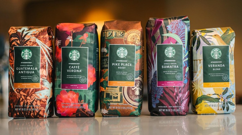
How is Starbucks telling the story behind its Veranda, Guatemala Antigua, and other beans this year? Bold colors of gold, copper, and purple designate blonde, medium, or dark roasts. While some design elements remain familiar, such as a scooter on the Italian Roast, the backgrounds of the bags incorporate elements of the region they're from, including tiger stripes and jungle-inspired plants on the Sumatra coffee and Seattle iconography on the Pike Place Roast.
These elements bring a visibly more harmonious design to all the products, while also displaying their unique qualities. To make the flavor profiles clearer to consumers, Starbucks also added updated tasting notes to each bag. The Veranda blend is now described as "toasted malt and milk chocolate," for example. These updated elements culminate in what Stand-Up Pouches says makes Starbucks so good at design: The coffee chain continues to make changes without confusing customers, providing them with a heightened understanding of the brand.

