The Real Significance Of Taco Bell's Minimalistic Logo
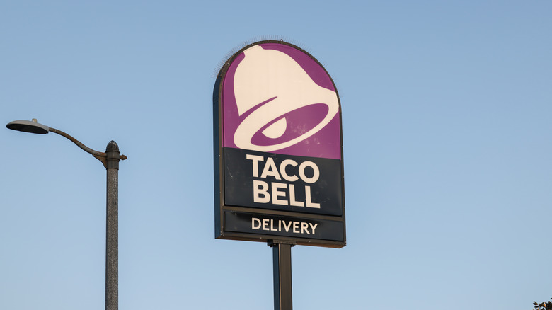
Familiar is the scene: the car radio humming on an evening ride home and the lights of fast-food restaurants and gas station signs shining ahead. Standing against the starry backdrop, rising above the trees, you can make out the golden "M" shape of McDonald's trademark arches, the red outline of Arby's distinctive cowboy hat logo, and the soft purple, black, and white of Taco Bell's minimalist bell-inspired logo.
Logos in the world of fast food are just as important to bring the customer in as the food itself. A good logo not only helps attract customers with design, but markets itself as easily recognizable, marketable, and straightforward. Since logos rely so heavily on design, it's natural for the design of these logos to change with the times. Burger King, for example, changed their 20-year-old logo to harken back to its older logos from the 1970s (per Restaurant Business Online) while in 2018, Dunkin' Donuts dropped the "Donuts" from its name to simply be called Dunkin' (per CNBC). As both the times and the people change, so too do the logos to better reflect and appeal to the tastes and trends of a new generation.
But how does simplification, especially in Taco Bell's case, help make a logo more attractive? Was it a mistake for Taco Bell to adopt the modern, minimalist style or does it have some impressive benefits?
Taco Bell's logo focuses on sophistication
For those who don't remember what the old logo of Taco Bell looked like, it was similar to the modern logo we have today but included a much more vibrant color palette. Rather than a variety of soft purples and whites, the logo was composed of dark purples, pink, and a splash of gold. It would be a very eye-catching sight if you were driving along the highway, spurring you to grab a Dorito-shelled taco and a Baja Blast. But if the purpose of the logo is to grab your attention, why shift to a minimalist style? Wouldn't Taco Bell want its logo to be as noticeable as possible?
According to Turbologo, the reason for this change lies in the idea of making the logo more "versatile." By shedding the bright colors, the new logo is now clean and sleek, effectively streamlining the logo by eliminating any needless distractions. The focus on the color purple, Turbologo adds, also helps to symbolize the idea of luxury and sophistication. This way, when you're eating a Chalupa in your car, you know you're eating in luxury.
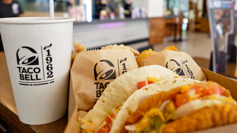
Taco Bell hasn't just changed its logo, but also its packaging. The company announced an overhaul to the design of its packaging, focusing more on a "rebelliously abstract design" for the bags, giving them the appearance of wild air-brushed graffiti you'd see in Southern California. A combination of sophistication and rebelliousness is certainly something unique for fast food.

