Twitter Is Feuding Over These Hershey Ad Campaign Wrappers
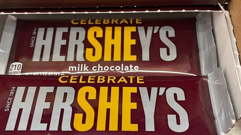
Hershey's and Valentine's Day are pretty synonymous because, really, what more says "I love you" more than a box of chocolates? But, for the past couple of years, the candy giant has expanded its winter marketing campaign beyond February to include a promotion that celebrates Women's History Month in March. On the Hersheyland website, the brand calls the campaign "Celebrate She," noting that all women in our lives, from family members to friends to authority figures, should be honored during the month of March — and what better way to do so than by gifting a limited-edition HerSHEy's chocolate bar?
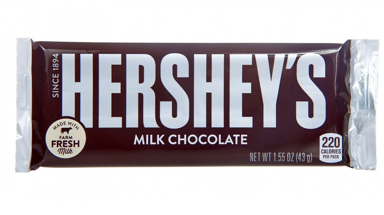
The special edition candy bars have the brand's usual brown and silver wrapper, though each highlights the word "she" inside "Hershey's" in a different color, and also includes the word "celebrate" at the top, suggesting of course that consumers "celebrate she" with the candy bar. While all this fanfare sounds great in theory, the truth is the execution doesn't pan out grammatically. As Twitter has pointed out, the correct word choice — "her" — is even already provided as another part of the Hershey's name. Insert marketing team face plant here.
Twitter is playing grammar cop with Hershey's
If you want to put out a successful marketing campaign, make sure you at least get your verbiage correct, or social media will be happy to roast you for it. Twitter user Parker Hamilton Poling tweeted out a pic of the HerSHEy's chocolate bars with the caption, "This boggles the mind from a grammatical standpoint. You had the object pronoun sitting.right.there." As of this writing, the tweet has garnered 319,700 likes and 28,900 retweets from grammarians everywhere, with some wondering what Hershey's could have been thinking when creating this campaign.
Others too have offered other alternative ideas. "Literally the other word 'her' is right there, they could've done something like 'celebrate her, she'd love it' ... but no," wrote one user. Another took a stab at both the wrapper's wording and layout: "Grammatically it's trash, but from a design standpoint ... it's still kinda trash," they wrote. One Twitter user, however, offered a possible explanation for using "she" instead of "her" and offered, "From a marketing standpoint, using the beginning of the word doesn't stand out as much as using the middle. It's an eye-catcher and a conversation starter." Whatever motive Hershey's had, clearly they got people talking — and as they say, no press is bad press.

