The Failed McDonald's Holiday Cup Design That Offended A Ton Of People
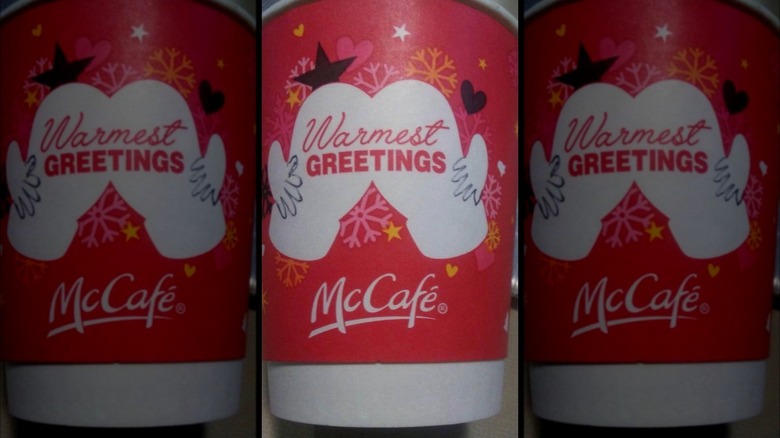
Remember the time McDonald's gave us all a friendly holiday squeeze? Their 2016 holiday cup demonstrated that beauty is truly in the eye of the beholder as a graphic design depicting white mittens went all wrong in an NSFW kind of way, to some discerning eyes (via HuffPost). And truth be told, when looked at from a different perspective, every innocent design like this one will have a Redditor just waiting with an original take.
Oddly enough, holiday cups seem to invite controversy all the time. Many likely missed this McDonald's snafu altogether, as the cup barely made headlines compared to other cringeworthy coffee moments. Twitter user Sam Sykes appears to be the first to have noticed this possible interpretation, sharing a photo of the cup with some helpful doodles back in 2016. "Now how the hell are Starbucks cups in the news again and no one's talking about a guy spreading his cheeks open on McDonald's cups," tweeted Sykes. The author helpfully added in a thread "(the hands are drawn on.)" for any who thought this was the fast food chain's original artwork.
The McDonald's design in question actually may not have been the most controversial in recent history. Starbucks' holiday cups have also put off some people before, including an accusation of creating a "war on Christmas" in 2015 and promoting a "gay agenda" in 2017 (via Vox). Apparently, the bar for holiday coffee cups is pretty tough to clear. So what exactly was wrong with the McDonald's design?
Extra warm greetings from McCafé
McDonald's has definitely made some bad decisions, but this might be one of the goofiest faux pas from the brand. As Reddit shared regarding the cup design, "'Warmest greetings!' cheerfully proclaims the spread a** on McDonald's holiday coffee mug." The Reddit post includes the picture of an innocent-enough looking red cup that features white mitten-clad hands joining together with the words "Warmest Greetings" scrawled across the middle in cursive and bold font. The background of the cup is adorned with colored snowflakes, hearts, and stars to make it seem sweet and jolly. But the issue comes into play when you look at the mittens from a different point of view (or with the help of a ballpoint pen) and then see that the way it's illustrated can make it look like someone holding onto a human rear end.
Once you see it, you really can't unsee it — and while it clearly offended many people, if also gave some a good chuckle. One person on the Reddit thread said, "Can't unsee now. My mornings are ruined." And on Twitter, another added, "Took me [the] LONGEST TIME to figure out what they were actually supposed to be, butt now I can't unsee it. (See what I did there)." While these cups have offered up a ton of ridiculous laughs, they have not garnered as much anger as other winter cup fails in past years.
There's a long history of controversial holiday cups
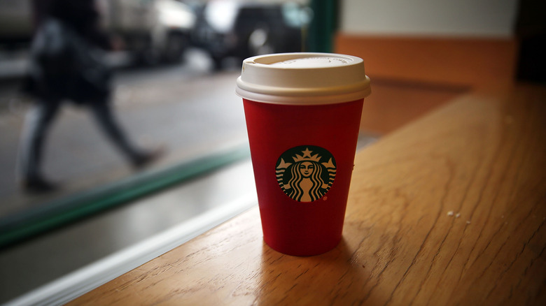
Food & Wine compared the McDonald's mitten cup debacle of 2016 to the Starbucks holiday cup snafu of 2015. At that time, the latter featured the Starbucks logo on a simple flat red background, and some took offense to the lack of specific Christmas or winter imagery in the design, per Time. During that debacle, one viral Facebook post declared, "Starbucks REMOVED CHRISTMAS from their cups because they hate Jesus," and the person who posted the message encouraged followers to give their order name as "Merry Christmas" to force Starbucks baristas to say the greeting. The incident also caused the "#MerryChristmasStarbucks" hashtag to trend.
At least the 2016 McDonald's cup didn't spawn that severe of a backlash. In fact, the worst amount of offense anyone took to the bizarre McD's design came from morning commuters and even company employees, who have responded to the image with replies like, "I work at McDonald's. I am now unable to unsee this," as well as, "But now every time I take a sip of coffee I just imagine myself drinking liquid hot a**" (via Reddit).
McDonald's won't soon forget that fated holiday cup
Others noted the tragedy of McDonald's attempting to create a milquetoast coffee cup design that completely backfired. Over on Twitter, some of the replies to the design included, "The hilarious thing is, they probably went with mittens because they're the least offensive thing ever. Womp womp." Another said, "That is an extremely unfortunate design. Don't any companies keep a 12-year-old on hand for this?" referencing the immature humor that probably precluded executives when assessing the design. Still, you have to wonder how it passed all the approvals at the company to make it to market.
But, for those who get a giggle out of graphic design and branding fails, perhaps the holiday hands will continue to provide a source of amusement rather than offense — after all, people seem to remember it every year around this time. If the choice is laughter or tears, always choose the laugh. Happy Holidays!


