The Hidden Message You Didn't Realize Was In The Twix Logo
Logo design is a fine art, and Twix has taken their branding to another level. The closer you look, the more you'll notice.
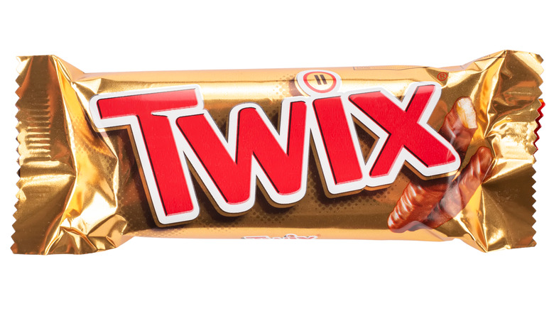
Printed atop a shiny gold wrapper, the current Twix logo features a 3D rendering of the letters that spell Twix in red and white, with a brown shadow said to represent the chocolate and cookie treat contained inside (via 100 Logos). One detail that fans noticed is that the dot of the "I" on the lettering actually features two lines instead of a single line or dot, more traditional to the lowercase letter.
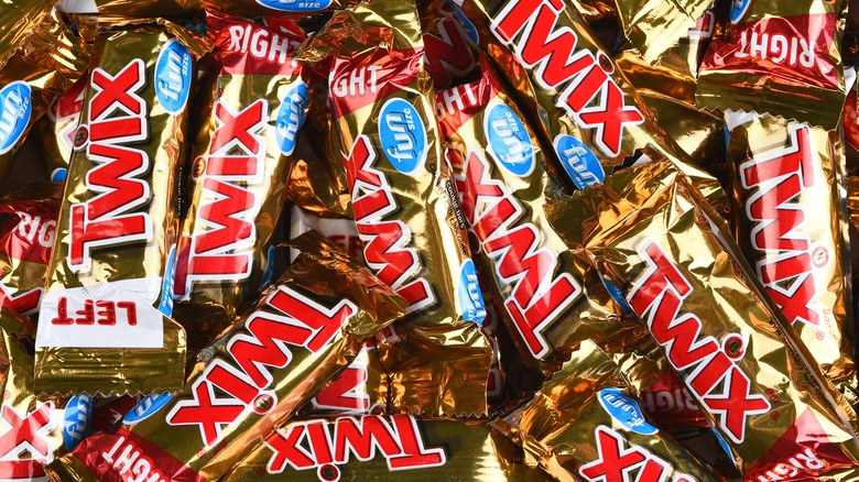
Now, you might think that this twin-line "dot" represents the two candies within (via Taste of Home). After all, the battle between left and right Twix has been rather epic. The company itself describes an imaginative feud between two brothers, Seamus and Earl, who fought until they created neighboring factories to create one candy on each side (via Twix). What's important to remember, however, is that this is a marketing campaign. Prior to the feuding left and right Twix, the company marketed this treat on the idea of sharing togetherness and taking a moment — which is where the image over the "I" comes from (via Brandon Gaille).
Twix wasn't always about two candies
The two dots aren't representative of the two pieces of the candy bar, but instead create a pause symbol (via 1000 Logos). In fact, this pause symbol didn't actually come to the Twix wrapper until 2010, with previous candies featuring standard lettering after switching from the original European candy name of Raider. The pause symbol coincided with the pre-left-vs.-right marketing campaign and included slogans like "Twix, A Break from the Norm" and "Twix, Need a Moment?" according to the Brandon Gaille blog.
Twix worked to sell people on the idea that they needed to pause and take a break to enjoy the sweeter things in life, and that idea is still evident in their wrapper today. A message that formerly embraced contentment may now visually represent two areas of disagreement. The hidden messages in the Twix logo can be taken from their original momentary intent, or adapt as part of the new fun candy rivalry created by parent company Mars.
But this wouldn't be the first time Twix has changed slogans, looks, or logos. It's a candy that was first introduced in the United States in 1979, says Snack History, and just like many other long-lasting brands, Twix has a history of reinventing itself.
The Twix logo has evolved over the years
Fascinating to many, logos are one of the most identifiable areas of any consumer brand, yet it's also surprising how subtle difference can go unnoticed. Prior to 2011, the "i" in Twix was just a standard, circular dot (via Campaign Live). This change in logo was designed to "reinforce the brand's 'break' positioning" and also may have been a competitive idea to match with KitKat's UK campaign to "Have a break" at the time.
Twix has changed its marketing over the years, also featuring slogans such as "Twix and Tea, Happy Together," "Twix, Try Both and Pick a Side," and "Twix, A Break from the Norm," according to the Brandon Gaille blog. And actually Twix has changed both its packaging and even the candy over the years as well. The gold packaging we know today can be attributed to an edit in 2000 that also changed the texture of the cookie biscuit, making it crunchier and less dense (via Snack History).
But even that's not as drastic as the Twix beginning — in fact the candy wasn't always called Twix.
From Raider came Twix
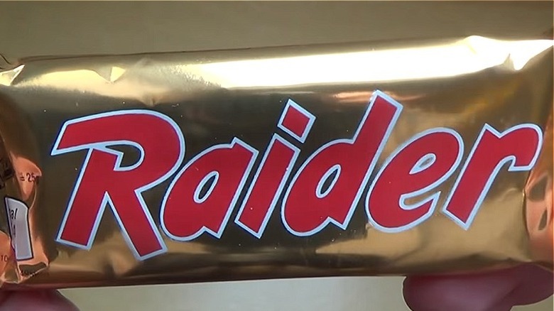
Even though Twix began in 1967 as a European candy bar called Raider (via Snack History), its introduction to the United States market in 1979 eventually included a name change rolled out in the 1980s. It took a while — "Twix" didn't get worldwide acceptance until as late as 2000. While the name change was eventually embraced, the branding move was met with ridicule. The changeover was frequently mocked for changing an item for generally minimal reasons. The company tried to calm the waters of candy lovers' outrage, marketing the product with "Raider is now Twix, nothing else changes" (via Snack History).
As one fan comments on Dark Wiki, "Raider now means Twix! (It's) still very popular in Germany today — regardless of the brand. Children of the '80s still use it today when something old comes along in a new garb. Even people who were born later know this saying. It is a piece of contemporary history here in Germany."
So while there's a hidden meaning in the Twix logo, there's an even larger hidden history about Twix itself. #TheMoreYouKnow


