Did The Taco Bell Logo Contain A Hidden Image?
"Fourth meal" is your favorite meal. You think Crunchwrap Supremes should be their own food group. Your friends are baffled by the fact that every kitchen cabinet and drawer in your home contains at least a handful of Fire Sauce packets. If these sound relatable, you might be a Taco Bell superfan. But even so, do you know where the whole "bell" thing came from? And, perhaps more importantly, is it conveying to us taco-hungry members of the public some secret queso-topped message?
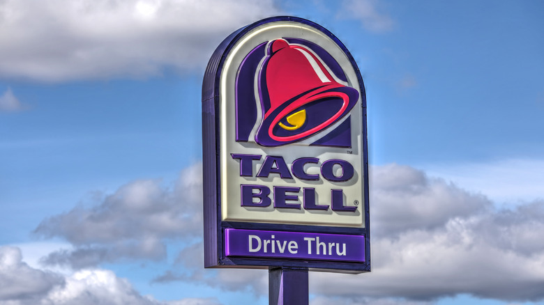
Taco Bell's logo is instantly recognizable and iconic. It might conjure up images of a beautiful, antique bell in a town on the California-Mexico border, ringing to signal the start of meal time. That sounds dreamy and all, but the truth is that the founder of this chain, which opened its first location in the Golden State in 1962, was named Glen Bell. Get it?
Though the bell in Taco Bell's logo doesn't necessarily have some profound meaning, some of us might still want to analyze that famous bell a little more. Is there something lurking in its pink and purple imagery beyond just representing the founder's name?
Some believe a taco is hiding in plain sight
According to Eat This, Not That!, fans of the chain have theorized that Taco Bell's logo references not just a bell, but a taco hanging out right before our very eyes. If this sort of Easter egg actually does exist, it's only been since 2015.
Taco Bell added a bell to its logo between 1984 and 1994, The Man in the Gray Flannel Suit notes. In 2015, Taco Bell updated that bell to the version we see today, and that bell, set at a tilt, features a yellow clapper, the part that swings inside a bell to make it ring. According to Creative Bloq, fans on Reddit pointed out that this clapper looks a lot like a taco.
"I've scoured the internet and somehow no one seems to have noticed before yesterday that the Taco Bell logo is actually a taco bell," notes user aelbaum. The clapper in the logo is indeed yellow, with a taco-like curl. Plus, the Redditor continues, "A clapper is not typically 40+% the size of the bells diameter." In other words, it seems like the logo designers wanted the taco clapper to stand out.
Not everyone's convinced, though. "Hear me out, it's just a bell," writes user paticusmaximus. "If they wanted to emphasize the taco shape, they could have turned the bell upside down and added a little lettuce around the outside."
So, what do you think? Is the bell just a bell, or is it a dead ringer for tacos?

