The Chick-Fil-A Logo Used To Look A Lot Different
A few things have never really changed about the beloved fast food chain Chick-fil-A. Since the opening of the restaurant in the 1940s, the company values have always been informed by the devout Christian faith of its founder S. Truett Cathy, for example — thus the reason Chick-fil-A is not open on Sunday, so workers have the chance to attend worship services if they so choose, according to Fox Business. So too has the chicken sandwich long been the proverbial main event when it comes to the chain's sales, despite their being myriad menu options available.
Other things about Chick-fil-A have changed markedly since its founding in the years just following World War II, however. For example, the name. According to Money Inc. the chain, which today sees average same-store sales of well over $3 million annually, began as a one-off restaurant named Dwarf Grill, and later re-branded Dwarf House. The name was not changed to Chick-fil-A until 1967, 21 years after Dwarf House had first opened.
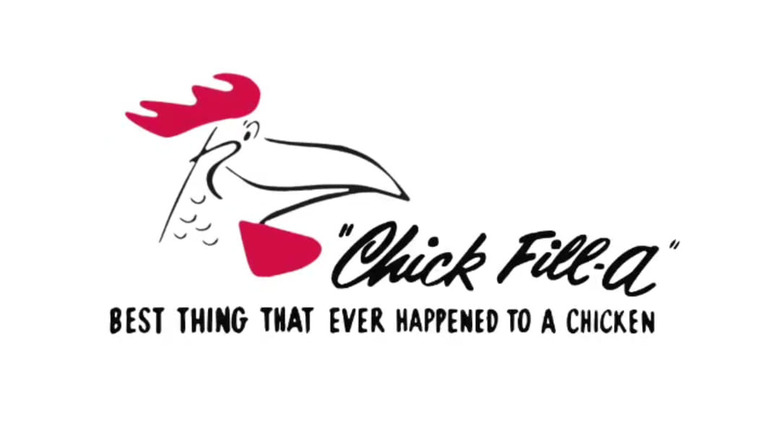
That same year, the first official Chick-fil-A logo was revealed, apparently having been first sketched on a napkin by founder Truett himself. It featured a cartoonish head of a rooster smiling beside the restaurant's name, and it would remain the brand's logo for the next two decades.
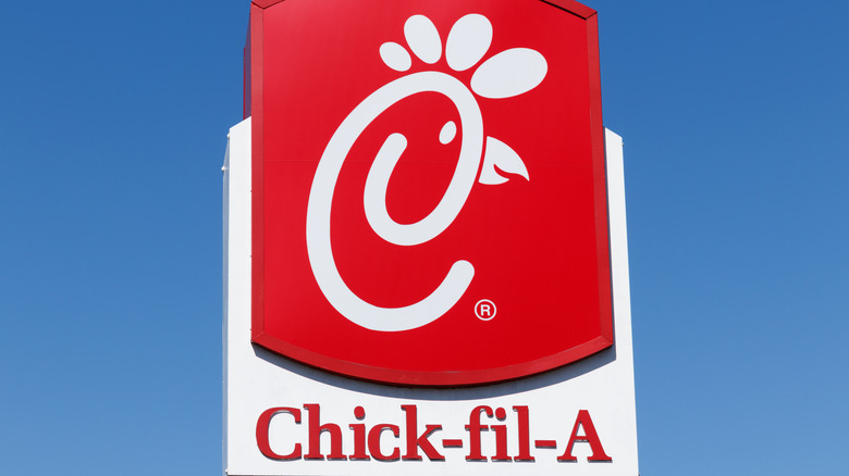
The current Chick-fil-A logo is more understated
The rather cartoonish Chick-fil-A logo would remain in use from the late 1960s until the late 1980s, albeit with several changes. For example, according to Money Inc., in the year 1970 the logo was changed to more closely integrate the rooster head cartoon into the name of the chain on signs where room permitted. This necessitated a heavy reworking of the logo to form part of the chicken into a shape like the letter C. The company also used and disused the colors red and black over the years, with some iterations in both colors almost evenly, some almost all black with red accents, and others all in red, as the logo has been since 2012, the year the chicken's beak was finally altered to more closely resemble that of a chicken, as opposed to the beak of a parrot, according to Logo My Way.
The Chick-fil-A logo has not undergone any major changes in about a decade now and none are planned (at least not publicly) but in the future it is entirely likely a new Chick-fil-A logo will grace 2,670-plus and growing number of Chick-fil-A restaurants in America and around the globe (via Business Insider).

