The Starbucks Logo Detail People Can't Believe They've Never Noticed
So you're a hardcore Starbucks fan, you've tried all of the drinks on the secret menu, you've been a gold member since they first rolled out their rewards program, and you've read up on all the weird rules its employees have to follow. But there's a small detail in the coffee chain's logo that even its biggest fans haven't noticed. We know, you might be thinking, "How could we not notice something in such a simple logo?" We said that, too.
The added detail wasn't actually there until 2011. Before that, the original logo went through a few prior redesigns. It all started in 1971 when the famous two-tailed Starbucks siren made her first appearance and began her journey to stardom. "She is not a real person, but we kind of think of her as one," according to Steve Murray, a creative director in the Starbucks Global Creative Studio (via Starbucks). "She's the biggest symbol of our brand, really, other than our partners (employees). She's the face of it."
The original Starbucks logo was a lot more detailed
Let's dial it back to the very beginning of the Seattle coffee chain's existence in 1971. Before its founders Gordon Bowker, Zev Siegl, and Jerry Baldwin decided on Starbucks as the name of the company, it was called Pequod (via Tailor Brands). Soon after, the founders renamed the store after a character in Moby-Dick called Starbuck. Their next step was to come up with an appealing logo that relayed their admiration for their hometown of Seattle (being a port city) and the seafaring world.
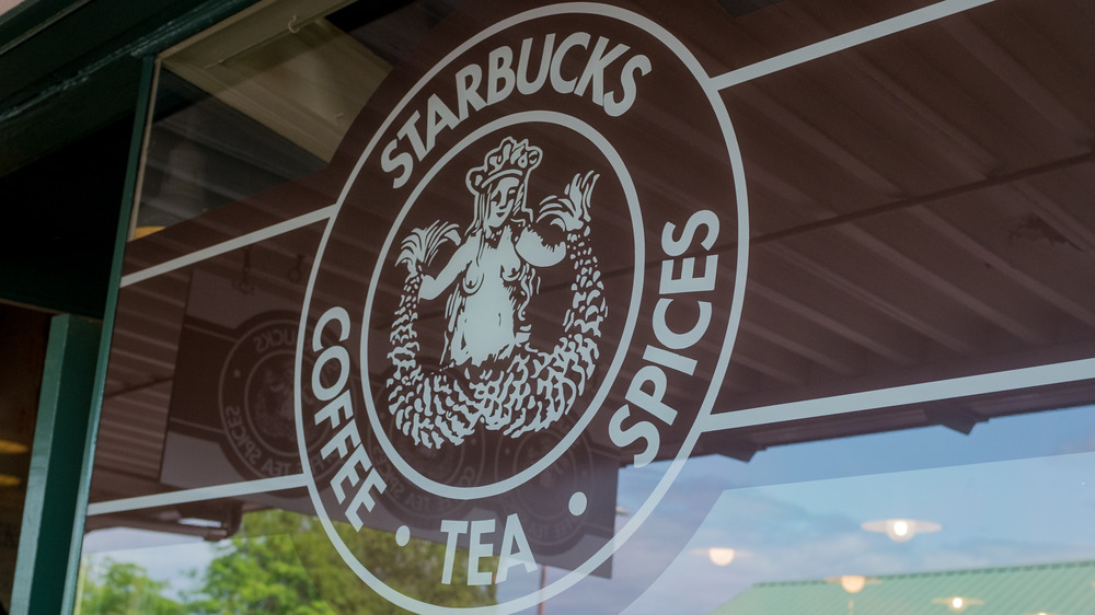
As the story goes, the founders read through some old marine books and discovered their muse: a siren in an ancient Norse woodcut, according to the brand. "They really loved the look of it and it kind of tied into what they felt Starbucks stood for," Murray said. "We took inspiration from that and created the logo from there. And she became the siren." And so, the first logo was designed. Its colors were brown and white and featured the entire siren (with details that have since been dropped from the design) enclosed in a circle with the words "Starbucks Coffee Tea Spices" written inside.
The Starbucks siren got a makeover in 1987
After 16 years in business, Starbucks was purchased by Howard Schultz, of Il Giornale, which was a small Seattle-based coffee shop. Prior to the two companies joining as one, Schultz had joined Starbucks in 1982 and served as the marketing lead (via CNN). In 1986, he left the company because he and the remaining founders, Bowker and Baldwin, were unable to agree on the future vision of the coffee company. At that point, Starbucks exclusively sold whole bean coffee and coffee equipment — no handcrafted espresso beverages (via Starbucks Melody).
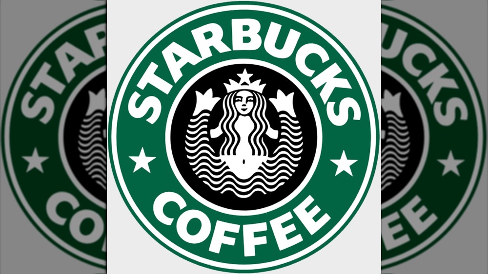
Fortunately, that parting didn't last long, and in August of 1987, Schultz bought the company for $3.8 million and Starbucks officially merged with Il Giornale. With Schultz at the helm of the brand, a new, more modern logo was in order — one that encapsulated both Starbucks' and Il Giornale's designs. Terry Heckler, the logo designer for brands like Panera Bread and New Balance (via Seattle Times), joined Schultz's team and made some pretty big changes to the original siren's design. He made it so the only words surrounding the siren were "Starbucks Coffee," her breasts were covered by her hair, the brown and white colors changed to green, white, and black, and most of the extra details were dropped to create a cleaner and simpler design.
In 1992, the Starbucks siren got her big close-up
In 1992, Heckler redesigned the beloved siren once again. He zoomed into the design so you can only see the top of both of her tails, her navel became no longer visible, the bottom of her hair was cropped, the text became sharper, and the shades of white and green were more saturated. He kept the same facial expression, the stars separating the name "Starbucks" from "Coffee," and the siren's star crown.
Between 1992 and 2011, the siren went through a few more redesigns, albeit typically subtle — except for a design the company tested out in 2006 for the chain's anniversary and later again in 2008 (via Star Tribune). They took the original black-and-white design from 1971, featuring the entire siren with all of its details, and added the words "Coffee and Tea." After receiving some pretty harsh backlash from their customers, Starbucks reverted back to the more simplistic 1992 siren design, but it wasn't until 2011 that the public was introduced to the siren that we know and love today.
The current logo redesign has one subtle change
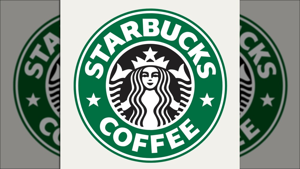
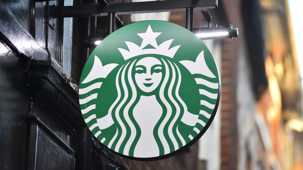
In 2011, the outer circle that read "Starbucks Coffee" was removed (since the company wanted to branch out and sell more than java) and the black background changed to green. Still, a subtle detail remained on the siren's face to make her seem more approachable and human-like. After removing the small detail in some prior experimental designs, Starbucks' global creative director, Connie Birdsall, told Fast Company that in 2011, the Lippincott branding team agreed they needed "to step back and put some of that humanity back in," regarding the contemporary, perfectly-symmetrical logo that the coffee chain experimented with.
So, the design team kept the long shadow on the right side of the siren's nose — a detail that many Starbucks fans never noticed — making it dip lower than the left side, which makes her face slightly asymmetrical. The subtle imperfection makes a massive difference, says the design team. "We didn't want her to be perfect, like Barbie, or other brands with characters," Birdsall added. "Wendy is too perfect. [The Siren] is more worldly. And not in the negative sense of 'worldly.'" Did you notice the siren's asymmetry?
