The Sam's Club Logo Used To Look A Lot Different
Though you might be hard-pressed to imagine a time before the bulk-buying convenience of Sam's Club was available, the brand has only been around since 1983. The company debuted, according to Money Inc., with a straightforward, black and white logo that doesn't much resemble today's version. The word "SAM'S" was written in all-caps, big, block letters, next to "WHOLESALE CLUB," which was typset in half the font size and split over two lines. A thick black line and two thinner lines underneath divided the eye-catching name from the smaller, right-aligned phrase "A Division of Wal-Mart Stores, Inc." written in title case.
The original logo held fast until 1990, when — wait for it — gray was introduced into the color scheme! This simple, short-lived version only lasted for three years and featured just two words, "SAM'S CLUB," in all caps. "SAM'S was on the first line in gray lettering against a lighter gray background, and beneath it was "CLUB" in conversing colors.
It wasn't until 1993 when Walmart converted Pace Warehouse Club to Sam's Club stores that a more vibrant color was introduced. This time "SAM'S CLUB" was in white on a bright blue background that was tilted at an angle to form a diamond. In 1999 an additional logo added a lime green diamond tilted the opposite direction in the background and a perky, orange arrow containing the cheeky phrase, "It's a Big Deal" in cursive. You can see some of the logos on Logos Fandom.
Sam's Club logos: 2006 and beyond
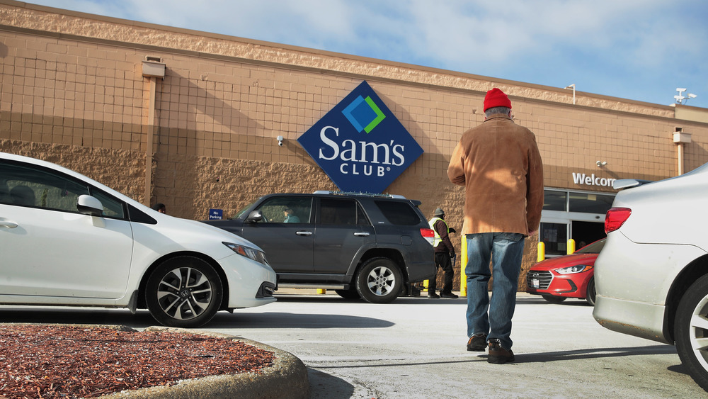
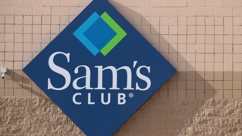
Blue, green, and white remained in the color scheme for the Sam's Club logo that was introduced in 2006. This logo had details that recalled the previous design, with interlocking, overlayed green and blue diamonds sitting above "Sam's CLUB" in a white font, all inside of a navy blue diamond. The new logo had similarities with a Bloomington, Minnesota-based health care provider chain, HealthPartners, and a let-go-my-logo dispute ensued that resulted in a settlement, according to the Star Tribune.
This dispute may have something to do with the new logo that was launched in 2019. This version has just two colors, blue and white. The words "sam's club" are now written in lowercase, in a modern font, and there are what looks like a greater than and less than symbol creating a broken diamond shape incorporated (via Money, Inc). As My F Opinion points out, the logo also resembles two HTML brackets, which may hint at tech innovations in the brand. Or, it could be seen as the negative space of the previous interlocking diamonds. Whatever the inspiration, it's a far departure from its black-and-white logo days.

