The Real Reason Popeyes Is Changing Its Logo
If you are headed to your local Popeyes location, you might start to notice some changes to the company's design beginning in the near future. Business Insider reports that, while many companies have been scaling down and cutting costs during the global COVID-19 pandemic, Popeyes has actually announced plans to expand globally.
The fast food chain, known for its fried chicken, sent Business Insider a press release on May 26th, 2020, publicizing a plan which included the unveiling of a new logo and redesign of the stores and packaging. Referring to this plan as "The Modern Popeyes Renaissance," the outline also includes an expansion goal that focuses heavily on growing their market in China, with the intention to open over 1,500 new stores throughout that country. Popeyes opened the first of these 1,500 locations on May 23rd, 2020.
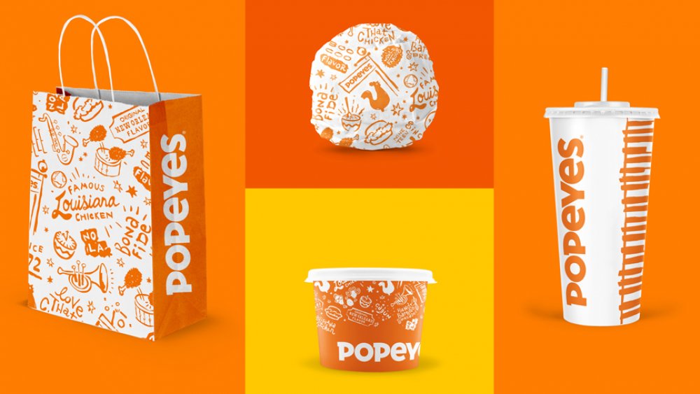
To go along with this international expansion, Popeyes is also introducing an updated brand identity that translates the company's "Louisiana roots with a more modern approach."
Popeyes new design is more streamlined and looks better digitally
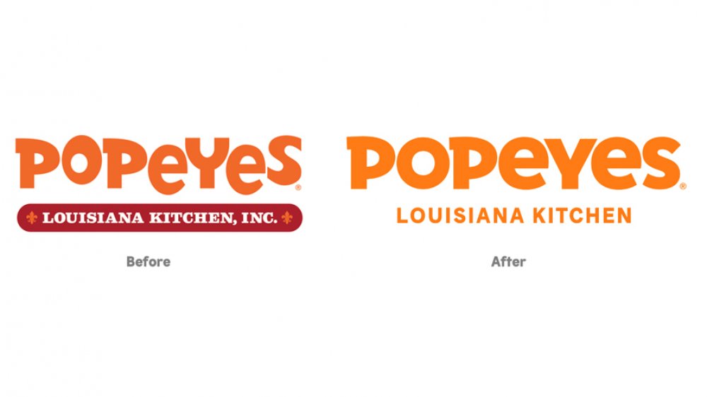
AdWeek describes Popeyes' new design as more mature and streamlined. The logo no longer features multiple colors, choosing to stick to the brand's signature orange and picking a typeface similar to the old one, but which is easier to look at digitally. Vice president and global head of design for Restaurant Brands International (Popeyes' parent company) Ralph Abreu said that when they decided to move forward with global expansion, the brand naturally had to rethink the way they present themselves.
They began to "look closely as at all the elements that we have in our identity to make sure it's aligned with our Louisiana roots, and also with our values and personalities." While the coronavirus crisis has stalled the upgrades in existing stores, Popeyes states that they will be ramping up renovations in late 2020 and throughout 2021 to compensate.
JB Hartford, the creative director at company Jones Knowles Ritchie who was tasked with modernizing Popeyes' look, told Fast Company the old design was incohesive and digitally unfriendly. For the brand's new design, Hartford attempted to balance the familiarity and warmth of the chain's old look with an updated color palette, cleaner logo, and quirky illustrations.

