Fast Food Restaurants Used To Look So Much Different
Once upon a time, fast food restaurants weren't just the providers of delicious, nutritionally devoid meals, but places so colorful that they were nearly as fun to look at as they were to eat in. Sadly, those days are long behind us. As we power through what we like to consider the "beigification" of interior design, it seems like nearly all fast food restaurants have followed suit, ditching the wonderfully garish hallmarks of the '80s and '90s to embrace a depressingly neutral aesthetic.
There's still the odd standout. For every one hundred bland McDonald's in the world, there's a gem like Sweden's ski-thru McDonald's or the "McMansion" in Maine. However, for the most part, homogeneously designed mixes of white, beige, and brown decor seem to be our fate now. We're not sure when fast food restaurants agreed that looking the same was the smartest business move, but we'd say it all started to change in the late 2000s. We've delved into the aesthetic history of multiple major chains to remind you of the creative, colorful restaurants of decades past.
Taco Bell
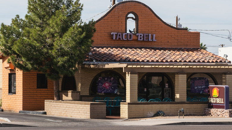
Glen Bell opened the first Taco Bell in Downey, California, back in 1962, so it should come as no surprise that the restaurants look a little different today than they did back then. While some things remain the same (such as the fact that they still sell, you know, tacos), the OG locations featured a very different logo, composed of a sombrero and bell. The exterior also featured an actual bell, which you won't spot at your local store today.
There were several other stages of Taco Bell looks before adopting today's slick but somewhat unremarkable aesthetic. Images shared on Reddit show a stereotypical Taco Bell in the 1990s when the interiors were primarily pastel and combined an array of era-appropriate shape decorations. While today's purple branding still very much played a role, this was mostly in the form of taco murals and stripy booths and tables. Strangely enough, the exteriors were purple-free, with red, yellow, and green taking its place on the logo instead.
If the Taco Bells of today don't appeal to you, there is one way to experience the original incarnation. In 2015, the fast food chain saved its original Downey restaurant (nicknamed "Numero Uno") from demolition by attaching it to a truck and driving it for 47 miles to Taco Bell's headquarters in Irvine. It was last reported to be living on stilts in the parking lot (but not selling tacos for 19 cents like in its former life).
Pizza Hut
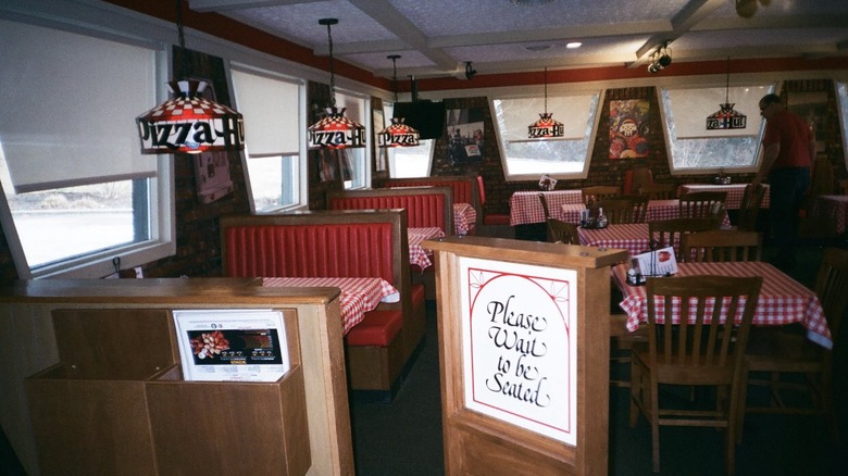
We'll say it: the Pizza Hut of today is sad. In the '80s and '90s, however, this was the place to be. From kids' birthday parties to weekend hangouts with your friends, there's nothing that those vinyl booths couldn't handle.
Luckily for us, some Pizza Hut restaurants are still clinging to their old identity. For example, a store in Mineola, Texas, allegedly hasn't been redecorated for decades. That means that, unlike today's exposed brick, industrial-style restaurants, diners can still enjoy the retro carpeted floors (we're not sure it's the wisest flooring choice for a pizzeria, but we're not in charge of cleaning it), themed stained glass chandeliers, and red-and-white checkered table cloths. Other stores were even more retro, complete with a jukebox and tabletop arcade games.
Back in the day, the exterior was equally kitsch. There was a stage when the majority of Pizza Hut restaurants were shaped like an actual hut, painted a classic Pizza Hut red. As per a throwback post on Pizza Hut's blog, "Many of [its] newest restaurants have since abandoned the red roof for a more modern design," and "the red roof might be best suited for a museum." Way to rub salt into the wound.
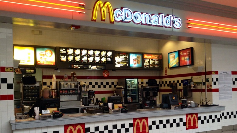
McDonald's
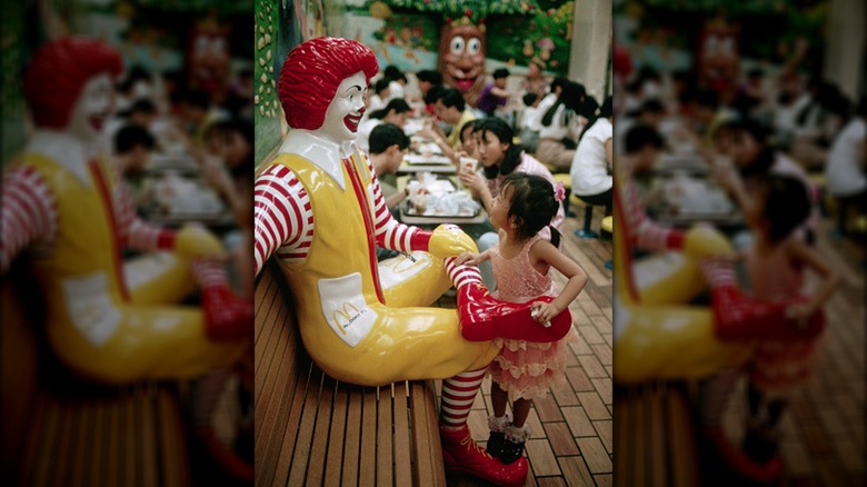
Can you believe that there's a generation of children who chow down on Happy Meals, blissfully unaware of Ronald McDonald's existence? The fast food mascot has never been officially retired by McDonald's (although there were calls to minimize the presence of kid-friendly characters at the chain in 2011 in an effort to tackle childhood obesity), but his presence is no longer omnipresent in its restaurants.
In decades past, however, he was inescapable. Statues of the clown were common features at McDonald's locations nationwide, as were actual meetable characters. At Ronald's peak, it's thought there were 300 clowns in McDonald's restaurants. Other characters also played a key part in the decor. Pictures from McDonald's restaurants in the '80s and '90s show seats shaped like hamburgers, as well as murals featuring iconic "McDonaldland" characters such as the Hamburglar and Grimace.
While the golden arches still serve as the McDonald's logo, its restaurants no longer use them for the same fun purposes as it did in the past. No restaurant embodied the old approach more than the World's Largest Entertainment McDonald's, a supersized restaurant in Orlando, Florida, that once checkered the entire exterior with the iconic yellow shade, as well as a giant box of french fries. Sadly, even this was stolen from us in 2015, reopening with a similar aesthetic to nearly all contemporary McDonald's stores — by which we mean corporate, sterile, and depressingly free of red and yellow paint.
Wendy's
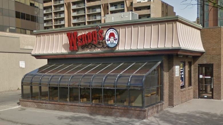
Food aside, dining at a Wendy's isn't the most exciting experience nowadays. Like most contemporary fast food restaurants, the tables and chairs are a standard beige or white. If you get really lucky, you may even stumble into a restaurant with a red wall.
This would be much easier to process if the Wendy's experience wasn't quite as cozy in the past. The carpets were colorful, the booths were green, and — most importantly — there were sunrooms. Yes, sunrooms. Back in the 1980s, multiple Wendy's locations featured large, glass-paneled sections where you could sit to enjoy your meal. Guests remember it so fondly that some even claim that Wendy's food tasted better when you were eating while bathed in sunlight. As one Reddit user put it, "I always felt like the most elegant 10-year-old in this space."
Of course, the experience wasn't quite as enjoyable when it was extremely hot or cold. Ultimately, it seems like this led to the sunroom's downfall. Wendy's started phasing out its sunrooms in 2012. As Ray Caliendo, founding principal of Art of Form Architects, explained to MEL Magazine, "They're an energy problem. Most of those sunrooms were built before modern-day energy codes — they're very inefficient. They increase the heat load tremendously during the summer, and in the winter, they're pretty cold." Sure, they may have been pricey to maintain, but can you really put a price on aesthetic excellence?
Popeyes
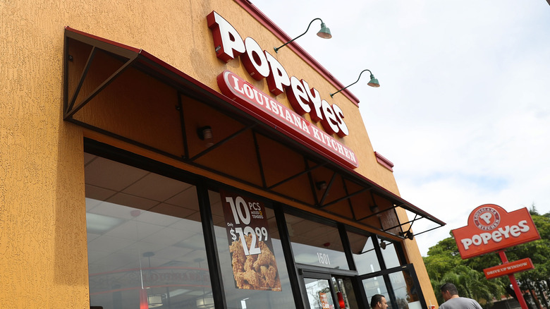
Contrary to popular belief, Popeyes wasn't named after everyone's favorite spinach-loving cartoon sailor. Instead, founder Alvin C. Copeland claimed that he borrowed the nickname of fictional detective Jimmy Doyle in "The French Connection." That doesn't change the fact that Popeye has been linked to the brand on multiple occasions over the years, starting the restaurant's sponsorship of the "Popeye & Pals" kids' TV show block on WWL-TV in the 1970s.
You could also find his likeness in the actual restaurant. For 35 years, Popeyes paid an annual fee of around $1.1 million to license the character from King Features Syndicate. The sailor was occasionally featured on the restaurant's exterior, which also featured red paintwork and, if you were lucky, a meet and greet with Popeye himself. Eventually, Popeyes grew tired of paying this licensing fee (which had grown increasingly pointless, considering its growing focus on its Louisiana heritage instead of its cartoon namesake) and ended the partnership in 2012, leaving its restaurants sailor-free to this day.
Burger King
Burger King was founded under the name of Insta-Burger King in 1953, but it's changed in more than just name since then. Not only has it ditched its red and white color scheme, but like most chains, it's cycled through several logos — one of which meant that for 14 years you could find a giant sign featuring a boy wearing a crown and sitting atop of a burger outside Burger King.
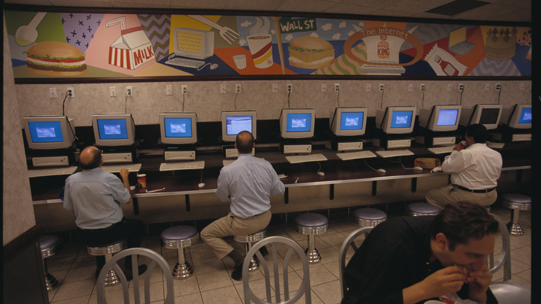
Fast forward to the '80s and '90s, and Burger King had fully embraced a colorful, quirky aesthetic that the chain has since described as "gloriously retro" (via Today). From the tables and chairs to the wall murals, pastels were the shade of choice. One store in New York City raced to embrace the internet age by allowing its customers free access to one of its 20 computers (if they purchased a meal, of course). Some even went the Wendy's route and featured a sunroom, overlapping with Burger King's short-lived foray into the world of table service in the 1990s. While we begrudgingly accept that change is inevitable, we do wish our local Burger King featured at least one of these quirky details today instead of the standard wood paneling and self-service kiosk combo.
Dunkin'
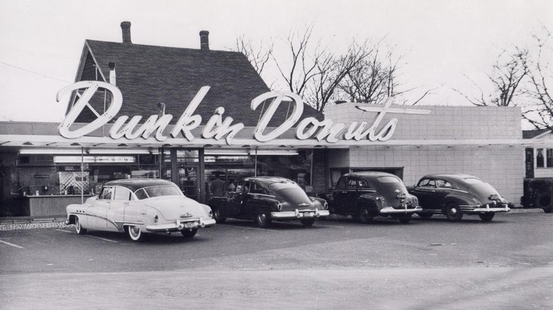
The first ever Dunkin' is located in Quincy, Massachusetts, where it's stayed surprisingly faithful to its roots. Other stores are a little less impervious to modernization. In 2018, Dunkin' started rebranding its stores after dropping the "Donuts" part of its name. This rebrand followed the stereotypical blueprint of wood paneling, neutral shades, and a severe deficiency of all things fun.
This is a far cry from the decor of the Quincy location, which was "retro-renovated" to the OG aesthetic back in 2011 (via Mass Live). While the paintwork matches today's familiar pink, orange, and brown color scheme, the logo still uses the retro font. The interior also features the same colorful, diner-style stools, open layout, and bakery display case used in Dunkin' stores prior to their modern makeover. Actual vintage Dunkin' stores also featured extensive shelves of donuts behind the counter. It's not entirely clear when this stopped, but we're willing to bet it correlated with the alleged increase in locations opting to have their donuts delivered in bulk instead of baking them in-store.
Subway
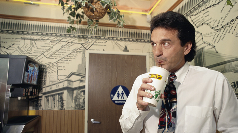
Subway's undergone several identity changes over the years. When Fred DeLuca and Peter Buck opened the first store in 1965, it was known as Pete's Super Submarines, before rebranding as Pete's Subs in 1968, then Pete's Subway in 1970. Finally, it adopted its current name in 1972, but its transformations weren't done quite yet.
The interior of Subway restaurants has shifted massively since then. For many, its most iconic form was its '90s aesthetic, when the walls were adorned with wallpaper inspired by New York's subway system. This was tastefully paired with fake leaves on the light hangings, plus dark green or neon yellow booths (the latter of which some claim to have spotted in random gas stations, cafés, and diners since Subway ditched said booths in the 2010s).
Its restaurants underwent a massive refurbishment in 2017, marking their first transformation in two decades — and one that saw them embrace a muted and inoffensive interior, with a few pops of green and visible fresh veggie displays. We may have lost the wallpaper, but at least the overall look is mildly less bleak than some of Subway's competitors.
Arby's
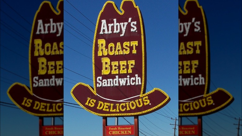
When the first Arby's opened in Boardman, Ohio, in 1964, it made its USP extremely clear. Outside the restaurant stood a larger-than-life neon sign, shaped like a hat and emblazoned with a straightforward message: "Arby's Roast Beef Sandwich is delicious." (Fittingly, the owners, brothers Forrest and Leroy Raffel, marked the occasion by posing with a supersized beef sandwich).
While the gargantuan sandwich sadly didn't become a regular fixture at Arby's restaurants, the giant hat did. For decades, you could find similar signs outside outlets of the fast food chain nationwide. However, they've become an endangered species in recent years, with the remaining retro locations either shutting up shop or adopting a much more minimal sign. The interiors have also lost some of their unique shine, having axed the colorful booths and tables of the '90s and replaced them with (you guessed it) more wood paneling and a few rogue splashes of red. Creative.
KFC
KFC is extremely proud of its heritage and still features its founder, Colonel Harland Sanders, on its logo, advertising, and decor to this day. Whether or not Sanders would be happy about this is up for debate. After selling the business in 1964, Sanders — who famously popularized the idea of pressure frying chicken and formulated KFC's iconic "Original Recipe" of 11 herbs and spices — became increasingly critical of KFC's food quality, declaring it "slop" and suing the chain for using his likeness to promote menu items he had no hand in creating (via New Yorker).
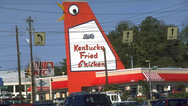
Needless to say, the food wasn't the only thing that changed at KFC after the Colonel handed over the reins. Some of the earliest KFC stores boasted red and white striped roofs, some of which were topped with tiny metal statues of Sanders. Another common hallmark of a KFC restaurant was a giant revolving chicken bucket, while others have adopted even more creative designs over the years, such as a giant chicken.
Inside, stores in the '60s and '70s boasted wood paneling quite unlike that of the fast food restaurants of today. We're talking about wall-to-wall, floor-to-floor wood paneling, complete with matching wooden tables and chairs. In the '80s and '90s, this evolved into cafeteria-style furniture with touches of pastels. Today, we're left with a far less flashy restaurant experience (think neutral colors with some red) – but, albeit, one still rich in Colonel Sanders cameos.
Dairy Queen
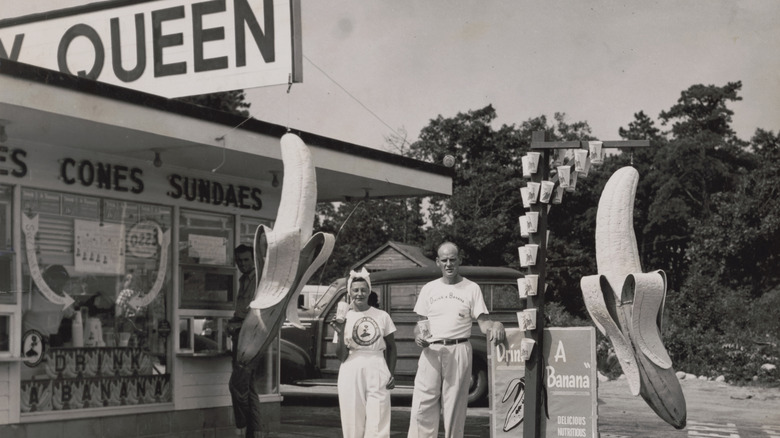
Every aspect of Dairy Queen has changed since it first opened. During the chain's earliest days in Minnesota, it was all about the ice cream — plus having a spot to hang out with your friends. Throughout the '50s and '60s, Dairy Queen was the hotspot for teenagers and young adults. As per TC Palm, "Boys could show off their hot rods or fast cars with cropped tops, Holley carbs, Hurst shifters, "moon" hub caps, glass pack mufflers and fancy fender skirts while the females conversed in some girl talk."
With patrons there to hang out and not necessarily eat, it should come as no surprise that these early stores were little more than stands (complete with era-appropriate neon signs) around which young patrons congregated en masse. As it branched out into hot food, such as burgers, Dairy Queen's stores expanded alongside the menu. From the '60s onwards, some stores were built akin to a barn, complete with milkmaid decorations. A far cry from today, where Dairy Queen's restaurants boast a more generic exterior, plus a logo that has simply introduced the restaurant as "DQ" since 2007.