The Story Behind A KFC's Famous Bucket-Shaped Restaurant
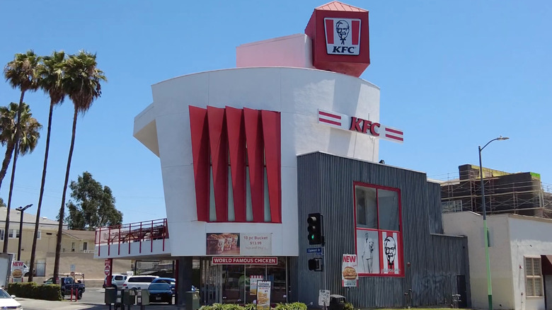
There is no shortage of wonky-looking standalone fast-food locations across the world. Taiwan has a Starbucks store that is made out of metal shipping containers. In Finland, there is a Burger King sauna big enough for 15 sweaty guests at a time, and in New Zealand, there is a defunct airplane now operating as a McDonald's where up to 20 guests can munch on a McDouble from the comfort of the ground. Los Angeles' Koreatown has its very own fast-food landmark — a two-story KFC that is shaped like a bucket of fried chicken.
In a way, the Koreatown KFC has the most logical design of the bunch — it takes the shape of one of the restaurant's fan-favorite menu items. The location, which is situated on the edge of Western Avenue, was built between 1989 and 1990, roughly 40 years after the first KFC in Utah opened its doors in 1952.
A chicken, a bucket of chicken, or both?
In 1989, Jack Wilke owned four KFC locations throughout Los Angeles, one of them being the Western Avenue KFC. Wilke wasn't happy with the current design of the building. To have the KFC of his dreams (one with a drive-thru and parking lot), a two-story KFC was his only option, he told The Christian Science Monitor in 1990. Most KFCs at the time were 30,000 square feet, and Wilke was working with a much smaller 8,000 square feet space.
Wilke, an art enthusiast, wanted a KFC inspired by Googie architecture and turned the project over to architects Elyse Grinstein and Jeffrey Daniels. Googie architecture was developed in the 1950s to be so eye-catching it would stop drivers in their tracks and lure them inside certain roadside establishments. However, KFC corporate wasn't initially on board with the project. KFC representative Greg Reynolds explained to The Christian Science Monitor the company wanted its customers to be able to easily identify its restaurants, meaning Wilke's design — a total deviation from KFC's standard image — was not ideal. But Wilke and Daniels still managed to get corporate to sign off on it.
While its shape resembles a bucket of chicken to some, others believe it looks like a chicken. Surprisingly, Daniels had neither in mind when designing it. "The intent was to create a constructivist building," Daniels told LAmag in 2018. There you have it. Wilke's KFC backs up the notion that art is open to interpretation.
The Koreatown KFC is divisive
Online, the Koreatown KFC gets a mixed bucket of reactions. One Redditor described it as "so ugly it's almost endearing." It also has the dubious honor of being listed as one of the ugliest buildings in LA. Its design — no matter how unattractive one might find it — is the entirety of its appeal, and the restaurant, which can seat up to 50 diners, has no shortage of visitors.
Still, some LA residents who grew up going to the location have fond memories of it, with another person on Reddit reminiscing about how they would "ditch bible study" every Sunday to hang out at the KFC. Wilke told The Christian Science Monitor that architects and owners of neighboring buildings had only positive things to say about the KFC. He said he had only ever heard one negative reaction to the building — from a senior citizen who told him she missed the previous KFC.
At least one expert believes the building is simply ahead of its time. "Late '80s, early '90s architecture isn't quite yet appreciated," Adrian Scott Fine, a director at the LA Conservancy, told LAist. "I say give this building another five to 10 years, and you might have somebody that says they think it's pretty or really attractive."


