Pictures That Show The Evolution Of Menus Over The Years
Most modern diners don't give restaurant menus a second thought. These items have become such an expected element of contemporary life that we can hardly go a full day without reading a menu somewhere. But even though the earliest examples date back to Ancient Egypt, menus weren't always a part of the dining experience. As restaurant service has evolved through the years, menus have changed, too, altering form to accommodate the needs of the hungry public through the decades. Chances are, if there's a visual presentation where words and images come together to accent one another, it's been a format for a restaurant menu somewhere along the line.
Where did restaurant menus get their start, and how did they transform into the colorful food catalogs and clickable smartphone apps we're used to today? It's a history best told in the form of photographs, with examples of significant steps in the evolutionary chain representing leaps in progress. From the simplest start as a printed list of dishes to the futuristic dots and dashes of QR codes, here's a visual history of how menus have changed through the years.
Delmonico's Menu
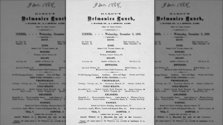
Though prehistoric evidence exists of restaurant listings in ancient civilizations, it was the New York City restaurant Delmonico's that first utilized a menu to present its offerings in the U.S. This upscale eatery is the modern ancestor of menus you've found in almost every sit-down restaurant you've been in. In olden times, there were no coordinated restaurants in the Big Apple. Rather, customers frequented smaller eateries where dining selections came on a whim. The Delmonico brothers changed the scene with their formal restaurant, complete with tablecloths and a chef-curated listing of dishes patrons could choose from — in other words, a menu.
Though this development changed the dining landscape in America, it didn't come at a leisurely pace. Early on, dinner at Delmonico's was a speedy affair, with each plate in a whopping 14-course meal being allotted around 10 minutes for diners to complete. Every element had a section on the menu, with an impressive array of dishes and prices listed. So, while choosing your own order from a set list was now a thing, it came with a frenzy attached. Eventually, the number of courses leveled off and possible selections for each were pared back.
Prix Fixe Menus
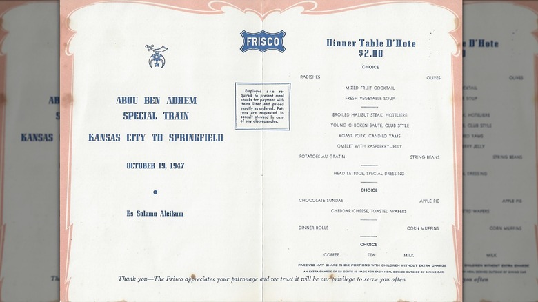
French for "fixed price," a prix fixe menu lists a specific selection of items served in several courses at a single price for the entire meal. As the name suggests, this style of menu began in France as the brainchild of early celebrity chef Georges Auguste Escoffier who cooked for royalty. Prix fixe was offered to groups of four or more, with the intent of making ordering easier for English-speaking patrons.
Though prix fixe menus are associated with fine dining, they've become popular in more casual settings, notably for holidays and special occasions. With a prix fixe menu, diners have a limited number of choices for each course, creating an easier flow for kitchen staff who know relatively well what to prepare without wildcards cropping up. There's an element of exclusivity that makes it exciting for diners, as if they are ordering dishes meant especially for them, even though everybody is ordering from the same list. Having one price for the entire meal prevents surprises on the bill at the end of the experience. Diners can settle in and enjoy all courses without wondering if they have enough room on their card to cover the entire expense.
Children's Menus
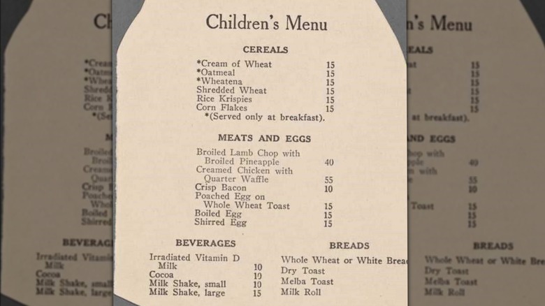
As long as restaurants have been a commercial enterprise, there have been kids' menus dedicated to the tastes of younger diners. The earliest children's menus were illustrated and included simple items that were relatively similar to the adult fare. Nutrition seemed to be a key factor in early children's menus, though decades of development in casual dining would eventually bring us to the Happy Meal era where fun and comfort became favored over health benefits.
But it was only in the mid-20th century that the idea of turning menus into fun activities for little eaters to enjoy came into vogue. As children's eating shifted to more frivolous fare, children's menus also took on a more playful dimension. Eventually, the disposable placemat-style menu we've all become accustomed to appeared. Akin to a coloring book, this activity sheet with food listings was served with crayons and was meant to keep tots occupied while waiting for their food to arrive. Menus in this form serve both the pre-iPad parents who had limited options for entertaining their children and waitstaff eager to keep control over the atmosphere by limiting hungry wails.
Women's Menus
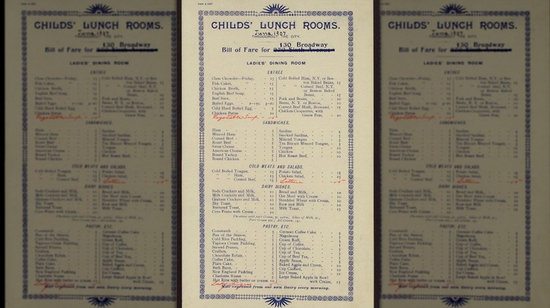
There was a time when women and men dined separately in restaurants. With this strange and disquieting phenomenon came the idea of the women's menu — a listing of dishes dedicated to female diners. Even after co-ed dining came into fashion, many restaurants retained separate menus to keep women from worrying about how much their dinner would cost. Sadly, these sexist menus are another example of how the patriarchy can impact the world, even when it comes to how restaurants operate.
While this sort of menu sounds immensely archaic, the truth is that women's menus continue into the 21st century in certain cultures. A lawsuit filed in the 1980s by famed feminist lawyer Gloria Allred aimed to eliminate the women's menu by declaring it discriminatory. But the trend persists into the 21st century. As recently as 2014, a Brooklyn restaurant created a lower alcohol women's menu as a "joke," and a restaurant in Peru was served a fine for continuing the women's menu tradition in 2019.
Chalkboard Menus
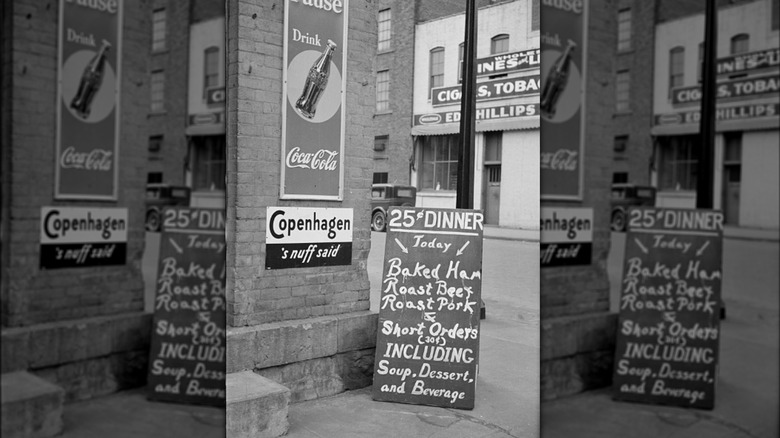
With the advent of the chalkboard as a tool for creating signs, the work of customizing menus at a moment's notice became a simple task for restaurants. This erasable menu allows restaurateurs to place their regular orders and daily specials outdoors to draw passers-by in for additional business. Indoor chalkboard menus allow changes to be made on the fly when new recipes spring from the chef's imagination or when customers show preference for certain dishes over others. Rather than having to reprint paper menus, cafes and bistros can simply wash their chalkboard and start fresh.
Chalkboard menus still capture the carefree charm of bygone days when cafés and bistros would use A-frame signs to advertise their daily specials on sidewalks in front of their locations. The tradition has never fully vanished — instead, it became an artform that lets illustrators and letterers display their work while providing winsome accents for contemporary eateries. Professionals like John Rozich have made careers out of designing chalkboard menus. As Rozich told the Seattle Met, "The artwork is central with the menu worked in, versus the other way around."
Drink and Dessert Menus
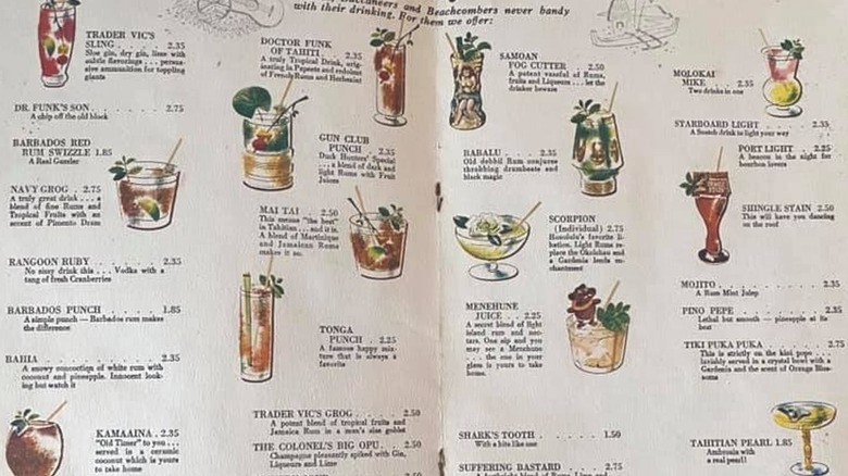
Due to their inherently different personalities, drinks and desserts stepped off of the bottom of the menu where they had traditionally appeared and began to appear in independent menus of their own. Illustrated drink menus gave personality to cocktail collections, showing splashy colors that helped tempt diners in the direction of the bar without making them leave their seats. And separate dessert menus are a sneaky way of preventing diners from ordering sweet treats, which aren't exactly a cash cow for dining restaurants.
Regardless, many sit-down restaurants keep their drinks and desserts menus on the table at all times. One reason is that having these separate menus makes it easier for waitstaff to take dessert and drink orders in a relaxed manner. Drinks and desserts sometimes even cross into one another's worlds in the form of boozy desserts or super-sweet desert-style drinks. Giving these special items their own menus makes it easy for diners to skip straight to the good stuff, depending on their appetites.
Photographic Menus
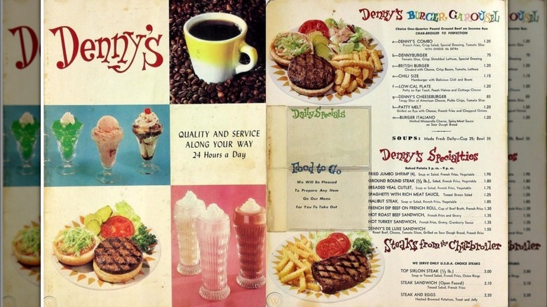
When color photography became affordable and easy to reproduce, pictures of the items listed on the menu began appearing as part of the listing. This development added a whole new dimension to the ordering experience, allowing customers to view the food before ordering. Earlier menus had featured illustrations on postcards made from linen paper, but they could only go so far. Once color photography took over, the glory of visual eating became a part of the menu experience for diners to savor.
With photographic images to represent dishes rather than verbal descriptions, customers were able to make more informed choices about what they wanted to eat. Of course, that doesn't necessarily mean that the photographs measured up to the finished dishes when they finally arrived at the table. The same is true for anyone who's ordered a Big Mac based on an image, only to receive a much flatter, less attractive version of the sandwich. But a drool-worthy picture is worth a thousand words when it comes to getting restaurant visitors excited about what they'll be eating.
Drive-thru Menus
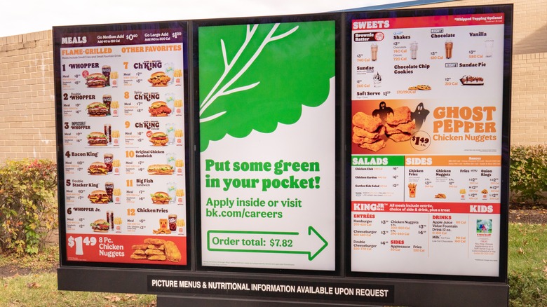
When drive-thru windows showed up on the dining scene, restaurants needed a new kind of menu that car-bound customers could read and order from. Enter the drive-thru menu, an oversized list that displays all options in a single space. Suddenly, diners could choose their dishes without even entering the restaurant. As technology advanced, light-up menus and digital screens became an expected feature of fast food dining. Drive-thru menus even allowed continued operation for restaurants during the COVID-19 pandemic, with certain limitations.
Perhaps more than any other style of restaurant menu, the drive-thru menu is a beacon of the communal food choosing experience for the modern diner. These glowing bastions of delicious feasting list incredible temptations awaiting vehicle-bound groups as they share their decision-making process with friends and family. It's one of purest joys of modern dining, and one of the lesser recognized secrets of fast food drive-thrus that casual diners can enjoy on the regular.
Online Menus
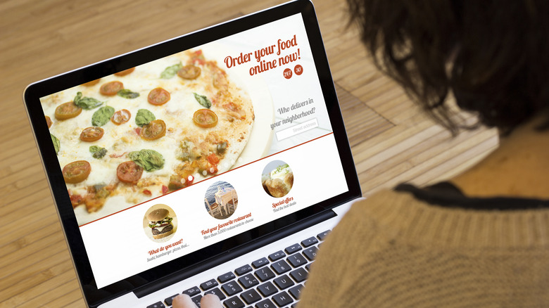
With the development of the Internet, restaurants gained the ability to post their menus online. Presenting a web-based list of food options provided customers the freedom of viewing and even choosing their dishes before they even left for the restaurant. It seems Pizza Hut was the first chain to take advantage of the new format, with its pizza becoming the first food sold via the Internet. A company called World Wide Waiter, which became Waiter.com, was the first food delivery company to offer a web-based menu — a hint of great things to come.
Once menus began appearing online, patrons were able to view new options before settling on a restaurant, expanding their possibilities for dining enjoyment. Likewise, restaurants found a new way to excite potential customers by reaching them in a digital format that could be advertised via email and eventually text message. This powerful development put restaurant menus in the homes of hungry patrons, who had yet to decide on what they were most hungry for. By offering special discounts available only to newsletter subscribers, restaurants could make a visual impact with their audience on a regular basis. Menus had entered the Information Age.
Tabletop Touchscreen Menus
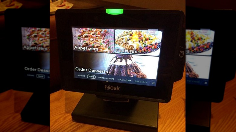
The advancement of touchscreen technology put the power of direct-menu ordering into the hands of diners. Restaurants began featuring tabletop tablets that allowed customers to choose their food from the comfort of their seat. One of the earliest of these devices came from Ziosk, appearing at chain restaurants around the world and revolutionizing the way diners thought about menus. It wasn't long before tabletop touchscreen menus became a regular sight. Suddenly, glowing screens could display still images, animation, and videos to enrich the menu-reading experience. The freedom of selecting food directly also meant shorter waits between being seated and placing an order.
As with any modern technology, these multi-function table tops tablets do more than just display menu items and allow direct ordering without requiring a waiter. They also feature games and activities to keep diners in lively spirits. Trivia and quiz games are popular with groups who enjoy challenging one another. If any added services are needed, patrons can summon waitstaff with a tap on the screen. And when it's time to pay the bill, a swipe or tap of a credit card will take care of the tab.
App Menu
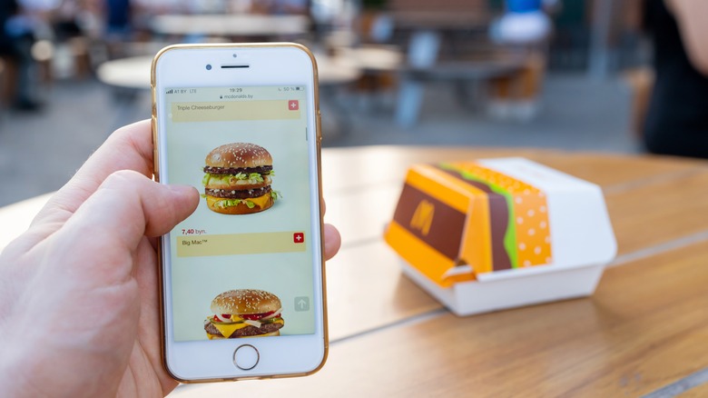
Once smartphones hit the market, restaurants began developing apps that would take the digital menu mobile. Menu apps made it even easier for hungry diners to submit their orders remotely. It's been said that Taco Bell was the first chain to create an app-based menu. Users can queue up their selections and schedule pick-up whenever suitable, putting the power of time management in their mobile devices. These app-based menus quickly went beyond the usual food listing to include daily specials tailored to the user's most frequent orders and loyalty reward programs that automatically converted dollars spent to points earned. And apps allowed food delivery services to evolve entirely and make it possible for restaurants to meet customers wherever they are.
As today's diners know, app-based menus make ordering from mobile devices as simple as a screen tap. Where written descriptions once enticed the indecisive into choosing something that sounded fantastic, vibrant visuals give patrons a clearer idea of their options, allowing them to track their history and lock in their favorites for future orders. This high-tech table-turning also allows restaurants to easily review the most popular items on the app and tailor their offerings to maximize traffic.
Kiosks
While restaurant menus continue to get smaller, one type of menu has increased the size of menu presentation, at least.
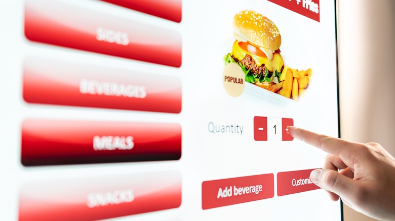
Kiosks bring the idea of digital app-based menus into a larger-than-life size format for in-restaurant interaction. The glow of brightly lit screens presents the high-tech sheen of tablets and phones zoomed up to an incredible scale. Enlarged images of food greet customers in high resolution, letting diners choose their options and process electronic payments easily using what's essentially a gigantic tablet. If you're tapped into the restaurant's app as well, your purchases and loyalty will be tracked as if you had used your mobile device. It's like playing a video slot machine where every prize is edible.
But the real innovation menu kiosks offer is the freeing up of restaurant workers to assemble customer requests rather than standing at registers taking the order. With kiosks serving as both a visual menu and a self-service POS system, the task of typing in each item is now the work of the diner, letting the workers get on with preparing and packaging the food.
QR Codes
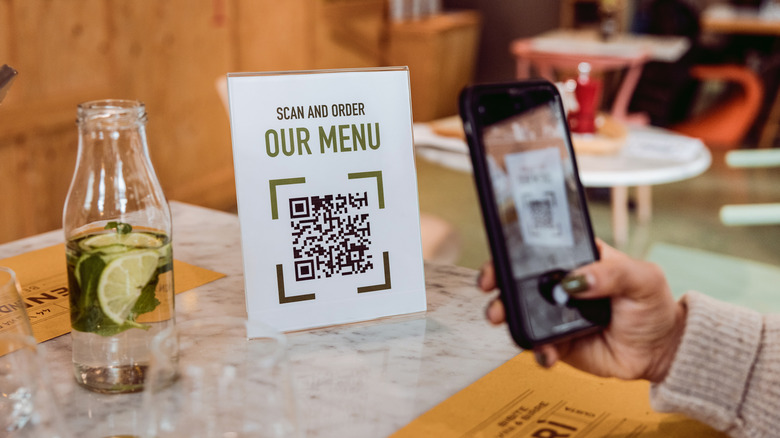
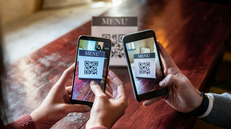
Rather than leaving customers to download an app or find their way to a website to view a menu, restaurants now use QR codes. These modernized barcodes can be scanned with a smartphone, allowing smartphone and tablet users to access entire restaurant listings without having to spell the web address correctly or even know the name of the restaurant they're ordering from. It's a direct link to the restaurant's website, available at a click for the utmost in digital menu convenience.
Additionally, QR-encoded menus introduce the element of surprise, letting users discover something available only via scan. Offering codes for special items or temporary promos creates a sense of fun for the user. QR codes also reduce space required for a restaurant's marketing and advertising strategy. A single QR code can be printed on business cards, flyers, and t-shirts to be used repeatedly by simply updating the URL the code leads to. This flexibility creates a powerful, instantaneous connection between patron and restaurant, fulfilling the need for fast gratification from tech savvy consumers in the dining world.
All this change is enough to make us wonder — what will the future of menus look like?
