How Burger King's Uniforms Have Changed Over The Years
Burger King has been on the scene since 1953, but the legendary franchise has evolved quite a bit since its humble beginnings as Insta-Burger King in Jacksonville, Florida. While the Burger King name has remained the same since 1954, the employee uniform has changed a lot over the years. The uniform worn by Burger King's earliest employees in the 1950s bears no likeness to what you see the workers in today. Many versions of the uniform have reflected culture and fashion trends of decades gone by, be it a shameless embrace of polyester and dated silhouettes or a series of efforts to rebrand the company image and broadcast a more contemporary aesthetic.
There are very few photographs circulating today that show the Burger King uniform from the 1950s into the 1960s. In the Insta-Burger King era of the early 1950s, female workers wore a fitted shirt dress with a check-patterned collar. Toward the end of the decade, the uniform transitioned to an all-white ensemble complete with a pointed paper hat with the words "Burger King Home of the Whopper" on the side. This look closely aligned with the designated uniforms of mid-20th century Mcdonald's employees and those worn by the waitstaff in soda shops or other burger joints. In fact, Burger King and McDonald's uniforms have often bore resemblances to each other and continue to draw from a similar sartorial pool today. Want to learn more about Burger King's style evolution? Read on for a timeline of uniform looks.
A poofy cap and mini dress had its way in the '70s
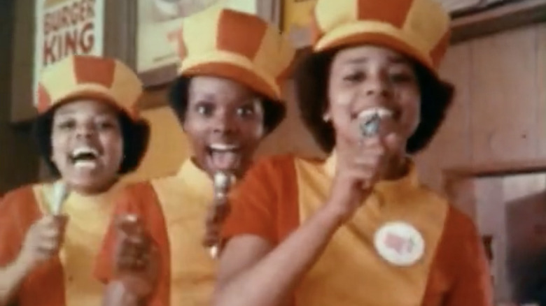
We're just going to say it: This was Burger King's most iconic look. In the 1960s, Burger King's ads were kid-focused and put emphasis on the animated mascot rather than the company's customer service. That changed in the 1970s with the debut of a new campaign with a brilliant slogan in which the employee uniforms took center stage.
The "Have It Your Way" jingle made for some seriously catchy commercials. The female singers featured in the ads wore Burger King's current uniform at that time: a mod-inspired mock turtleneck mini dress with vertical red and yellow stripes and a poofy newsboy-style cap in a coordinating striped pattern. "Have It Your Way" explained how Burger King employees are happy to fulfill your customized meal order. There was a light pop version and a soul version — both were catchy, but the soul version was danceable. The singing girls and trendy Burger King uniform were a huge success and signaled perhaps the most singular era of brand identity Burger King has ever known.
This red and yellow uniform stuck around for most of the 1970s, but the look went from mod to mom depending on the franchise location. An alternate version of the uniform included a pair of red slacks and a frilly apron. And the color scheme? Some could argue it was a little too close to the colors of Burger King's fiercest competitor, McDonald's.
The franchise played with new color schemes in the late '70s
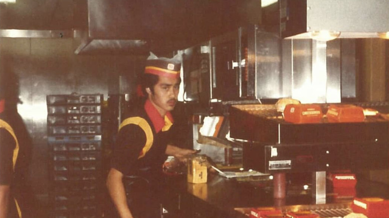
As the 1970s dwindled down, Burger King set out to revise its employee uniforms, but the changes weren't drastic. Instead, the red and yellow (which has been thought by many to symbolize ketchup and mustard), was joined by a dark, almost black, shade of brown. This blatantly retro color combination was very much in step with the times, as was the polyester shirt material and oversized collar. The poofy newsboy cap that female employees previously wore was replaced by a flatter striped hat. Male employees wore a pointed paper hat adorned with the Burger King logo. The updated uniform was rolled out alongside a new ad campaign, 1978's "Burger King and I", a jaunty little tune about people's appreciation for BK's flame-broiled burgers that are never fried like the ones at say, McDonald's or Wendy's. No, it wasn't advertising gold like the "Have It Your Way" commercials, but it did fit in with Burger King's image of being a modern fast food eatery where cheerful employees and quality food were the company standard.
Once again, Burger King's color choices didn't read as entirely original. Contemporary competitors of the day such as Whataburger also had a brown collared shirt as part of the uniform that was accented with yellow and orange and accompanied by a brimmed hat for the ladies and a paper hat for the guys.
In the '80s came the plaid phase
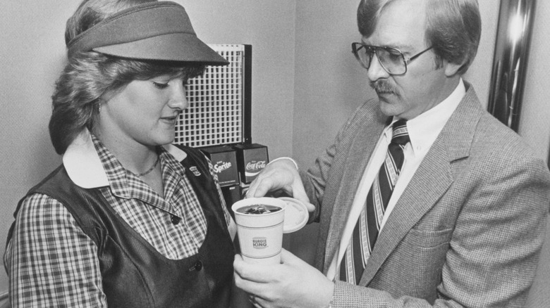
We aren't kidding: Burger King's plaid era was kind of cute. In the 1980s, Burger King shook off its groovy aesthetic and went for something more buttoned up — literally. This was also around the time that BK introduced the humblest of all fast food worker headpieces: the visor. Can you even call it a fast food restaurant if a visor hasn't been part of the uniform at one point or another?
The new uniform included a red, yellow, and blue plaid button-down shirt with a pale yellow collar as well as a rust-colored snap-back visor (or a snap-back trucker hat). To complete the ensemble, female employees wore a scoop-neck vest and pants (also in rust), and male workers donned a boxier, v-neck vest with matching slacks. The vest and pants were made of polyester and had a ribbed texture to emulate that of corduroy. The female vest was a form-hugging, smock-style fit with a slight peplum waist that differentiated it from the male uniform. There is no question that this Burger King uniform screams '80s, but it's got a charming throwback quality that reads more cutesy than cringe.
Burger King tried to go formal in the early '90s
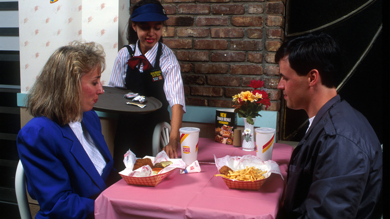
Burger King's business casual uniforms went a step further at the onset of the 1990s when the fast food titan toyed with the idea of table service. That's right — in order to extend its reputation beyond the grab-and-go concept, Burger King adopted a more formal approach that was reflected in the employee uniforms. Striped, short-sleeved button-down shirts and secretary-esque neck ribbons were worn in an effort to play up Burger King's fleeting status as a sit-down dinner restaurant for families (complete with pink tablecloths and tabletop flower vases). Burger King may have been one of the few restaurants that required its waitresses to don both a visor and an apron with their dressy-ish shirt and ribbon tie, but considering that these workers were expected to switch from tableside service to ringing up customers at the cash register up front, the uniform's disjointed look almost made sense.
To make the table service feel more genuine and eliminate the customary to-go feel of Burger King's menu items, traditionally paper-wrapped Whoppers and portions of French fries housed in cardboard containers leveled up and became "dinner baskets", complete with side dishes and complementary pre-entrée popcorn. Despite the valiant effort, this attempt from Burger King to head in a different direction only lasted from 1992 to 1994.
Neckwear is often part of the uniform
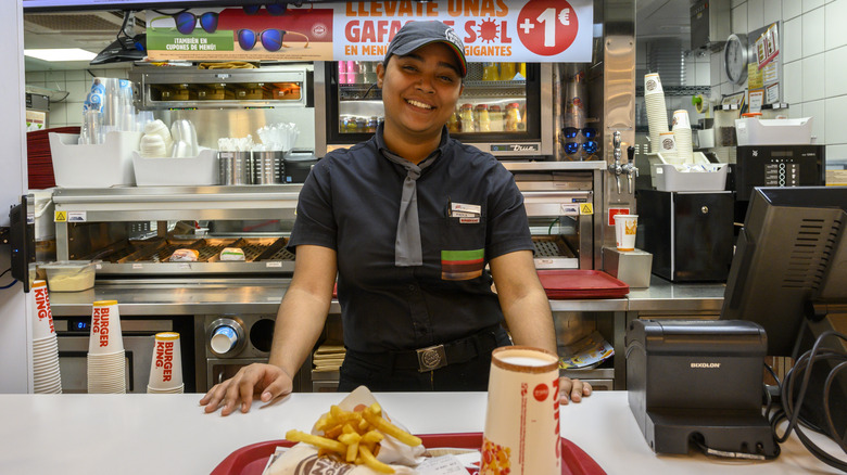
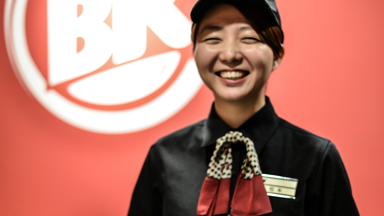
Walk into just about any Burger King and you will likely see one or more workers behind the counter sporting some sort of neckwear, be it a run-of-the-mill necktie, a ribbon, or a scarf. In many Burger King franchises, these workers who are a little more dressed up are managers.
On the other hand, in some Burger King locations, mandatory neckwear isn't just the dress code for management, it's part of the uniform for all employees and has been for years. It's certainly not unusual for fast food employees to be less than thrilled about their uniform but in Barcelona, Spain, Burger King employees decided to rally against the neckwear requirement, claiming that making male employees wear neckties and female employees wear ribbons around their necks was sexist (the dress code also required that men be clean-shaven). In 2019, after a lack of action from Burger King, the matter was reviewed by the Spanish government. Sure enough, regional labor inspection officials agreed that Burger King's regional dress code did "infringe the constitutional rights of workers, namely, the right to one's own image and the right to equal treatment ... " (via The Guardian). Since then, Burger King employees in the Barcelona area may grow facial hair and slip off their neckwear if they choose to.
What about the Burger King uniform in other countries?
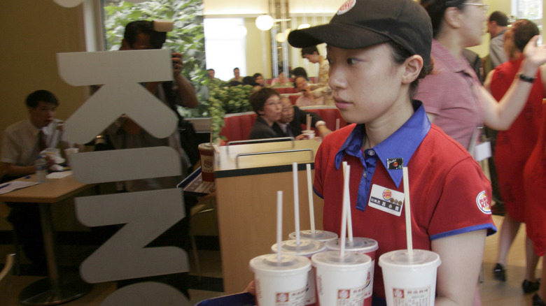
We know that Barcelona Burger King takes its uniform policies pretty seriously, but over the years there has been a significant variance in the company uniform internationally. Seeing as Burger King is a franchise, not all Burger King locations have to conduct business in exactly the same way. This means that the company uniforms have not always been identical in every location. There are approximately 11,000 Burger Kings currently operating outside the U.S. When the first-ever Burger King opened in Shanghai, China back in 2005, the employees there wore black Burger King baseball caps and fitted red polo shirts with a silky blue collar and the Burger King logo embroidered on the sleeve.
In 2021, a Burger King in Cologne, Germany became the first in the world to do business as a completely meat-free facility. The employees at the Cologne location wore a minimalistic uniform consisting of a white t-shirt emblazoned with the original, less flashy version of the Burger King logo paired with a plain brown baseball cap. The simplified look perfectly complemented the modern, clean-eating concept of the all-new vegetarian Burger King while also representing some major style changes that were happening within the company at that time.
Polo shirts and t-shirts were the preferred uniform for many years
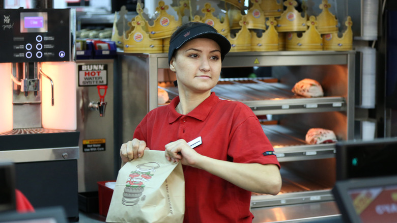
Managers may be expected to wear neckties while working behind the counter, but throughout the '90s and into the 2000s, the majority of the staff kept it casual, wearing a uniform of polo shirts and official Burger King t-shirts to work.
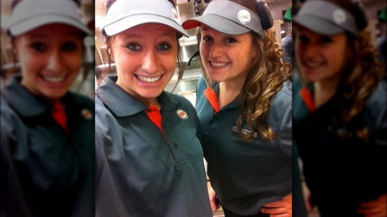
The classic polo shirt and visor/baseball cap routine was alive and well in Burger King's not-so-distant uniform past. Over the years, Burger King polo shirts have come in quite a few different colors, including pale blue, maroon, black, red, yellow, and bright green. Promotional t-shirts have also been a popular uniform option for Burger King workers. These t-shirts offered a comfy alternative to the standard polo while also serving as a walking advertisement for specific menu items or limited-time promotions. At the same time, this era was marked by a generally mismatched approach to what staff members wore from day to day. It was also a time in Burger King's uniform history that lacked a distinct point of view. At a glance, you probably wouldn't be able to tell the difference between a Burger King, McDonald's, or Wendy's uniform. Burger King's earlier uniforms were definitely kitschy, with some styles coming across as borderline goofy, but we have to admit they were a lot more interesting than what workers have worn in more recent times.
There was some gray area in 2012
By the 2010s, it was time for Burger King to take a long, hard look at the state of its restaurants in the midst of a rapidly changing world. In 2012, the company made a series of great strides to revamp its overall image. This included a major overhaul of its food and drink selections, a complete dining room makeover, and a brand-new uniform.
The color scheme went neutral, featuring a slate gray polo with red accents and a matching gray stain-resistant apron. This change in the uniform was made with employees in mind — they were consulted about what they wanted to wear on the job. The gray uniforms worked with the sleeker image that Burger King was aiming for, which included a more tech-friendly atmosphere, a trendier assortment of menu options, and a celebrity-packed ad campaign that featured the likes of David Beckham, Salma Hayek, and Mary J. Blige. This was also one of the rare instances where McDonald's borrowed from Burger King's marketing strategy and not the other way around. In 2017, McDonald's unveiled a head-to-toe gray uniform complete with a gray apron. Funnily enough, when Burger King went gray five years earlier, there was little to no reaction in the media. When McDonald's ventured into the same drab territory, there was a great deal of online criticism, citing McDonald's monochromatic uniform choice as robotic and dystopian.
An attempt to modernize the uniform was made in 2015
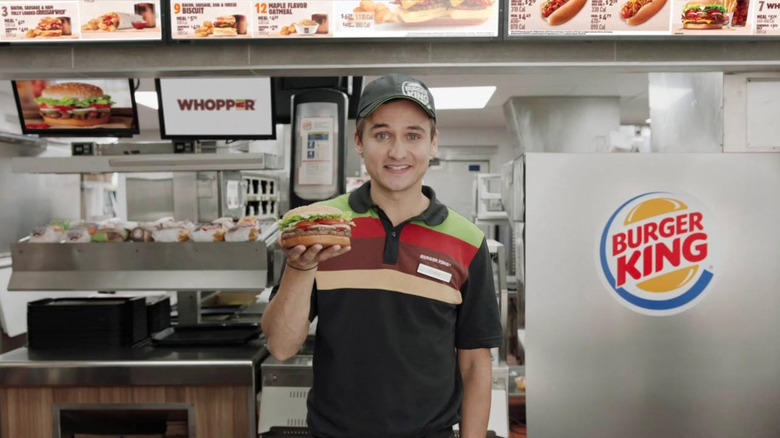
Three years later, gray was out and stripes were back in when Burger King decided to update its image yet again. This time, however, the source of inspiration behind the new uniforms wasn't as much about keeping up with the times. Instead, it was based on the ultimate crown jewel of Burger King's brand: the Whopper.
We'll be honest, the Burger King polo shirts that came out in 2015 don't immediately conjure up an image of the Whopper, but maybe it's supposed to be abstract? The predominantly charcoal gray polo has four horizontal stripes across its top half. The first stripe is green, followed by red, then brown, and lastly tan. This color sequence symbolizes the layers of the Whopper: the lettuce, tomato, meat, and bun. Get it? And yes, we also noticed the absence of a thin white stripe to represent the onions. Oh, and the charcoal gray isn't just a random background color, it's an homage to Burger King's time-honored tradition of flame-broiled burgers.
This redesign was propelled by Burger King's North American chief marketing officer Fernando Machado. His goal was to create a uniform that would set Burger King apart from other fast food chains while providing employees with something comfortable to wear. It became standard-issue workwear for every Burger King across the globe. In spite of these thoughtful efforts, more changes to the uniform were only a few years away.
The modern-day rebrand
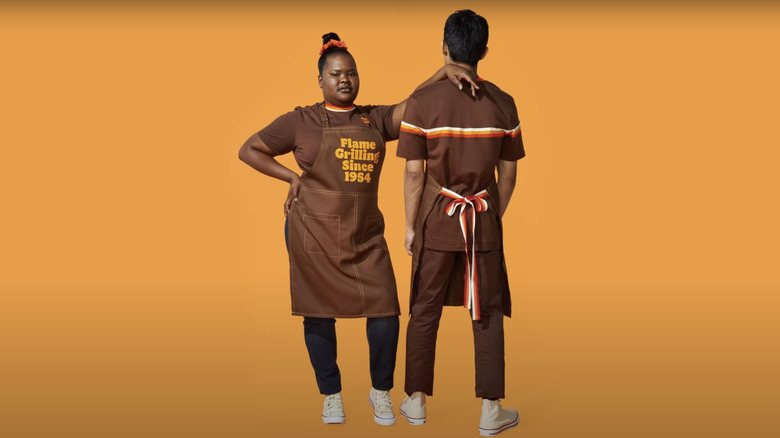
We love it when all-powerful chains go back to their roots, which is exactly what Burger King did in 2021. Burger King worked with creative agency Jones Knowles Ritchie to completely rebrand the overall look of its logo, food packaging, and uniforms. The result is bright and fun yet leans toward minimalism while winking at some of the restaurant's most iconic eras.
The latest uniform isn't just a polo, t-shirt, and a hoodie, but rather a mini wardrobe of sorts that employees can mix and match the way they would with their regular clothes. There are several pieces in chocolate brown with orange, red, and yellow accents that harken back to the franchise's glory days of the 1970s yet maintain a focus on inclusivity and modernity. T-shirts with punchy graphics of burgers and fries can be mixed and matched with track-style jackets. There are also utilitarian-inspired aprons with the phrase "Flame grilling Since 1954" printed on the front in a unique neo-retro rounded font called Flame Sans. As we saw with the t-shirts worn by German employees at the vegetarian Burger King, the glossy, circular logo that's been used since 1999 has been replaced by the original Burger King logo: a straightforward burger bun graphic with the words "Burger King" nestled inside. Chief marketing officer Fernando Machado aspired to create an iconic Burger King uniform in 2015, and his ideas laid the groundwork for what now appears to be a fully-realized artistic direction that this classic brand deserves.
