Most Restaurant Menus Are Full Of These Mind Tricks
We may receive a commission on purchases made from links.
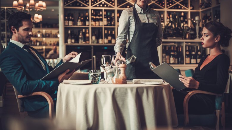
It's no secret that a lot of work goes into designing every aspect of a restaurant. Food is just one part of it, and there's also decor, music, ambiance, seating, lighting... the list goes on and on. Many of those you may never even notice, but don't worry, they're influencing how you feel about the entire experience from the moment you walk in the door.
Sure, you might not notice the mood lighting, but there's one thing you're supposed to notice: the menu. It doesn't matter if it's written in script so fancy you have to squint or if there are more photos than words, there's a whole science behind menu design. It's so discreet, you probably won't even be aware of how it influences you, but there's been a ton of work done on figuring out how we react to what we see in menus, where our eyes go first, and what kind of little psychological tricks can be used to guide you toward ordering items with the highest profit margins. How? Here's how they do it.
Don't think about the Benjamins
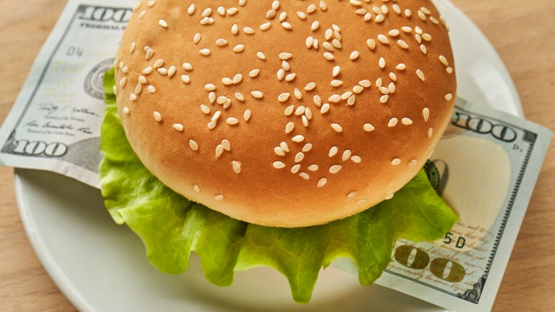
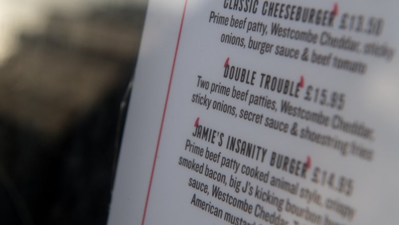
Most diners make decisions based on both the menu item itself and the price. While we need to keep an eye on our own finances, restaurants are hoping you spend some serious cash and opt for menu items that have the highest profit margin. Surprisingly, there's one simple thing they can do to make you spend more: make sure there are no dollar signs on the menu.
Take one study from Cornell University's School of Hotel Administration. When they gave customers three different menu types — those with prices written out as numbers with dollar signs, as numbers alone, and in words — they found people who were handed the menu with prices written out in numbers only (with no dollar signs) spent way more money.
It all comes down to the idea that they're drawing your attention away from the fact that you're spending your hard-earned cash. It's the same reason why menus rarely use the old format of menu items and descriptions on the left, and pricing in a column on the right. Restaurant consulting group Aaron Allen & Associates says that format encourages people to look for the lowest prices instead of the best-sounding menu item, and no restaurant wants that.
The golden triangle
Imagine you have a menu in front of you. Now, imagine opening it and looking at it. Where do you look first?
There's something strange that happens when we look at a menu, and according to restaurant consulting group Aaron Allen & Associates, the first place most people look is at the center. Research has been done on what happens next, and they say it's a reflex to next look to the top right, then to the top left. Those three points are called the "golden triangle", and it's where most menus will put their highest-grossing dishes.
There's another trick here, too, based on where your eyes fall first. Most restaurants find that if their menu is divided into sections, the most popular items are the top two on the list — no matter what they are. That's what we see first, that's what stands out, and that's what we order. That also means that's where they're going to put those high profit-margin dishes, too. Even more reason to look at the entire menu next time.
They didn't want you to order that, anyway
Here's another question: how often do you order the most expensive thing on the menu, and how often do you order the least expensive thing? The answer is probably the same for both, and it's, "not often." Restaurants know this, too, and many use decoy dishes they'll price highest or lowest and include only to get you to order the second-most expensive or affordable options.
They're called decoy dishes, and according to Berkeley Wellness, they're there to make other dishes just seem like a better option. Let's say you're out at a steak place. You might not normally opt for a $29 piece of meat, but when you take a look at that $37 steak, $29 seems like a better deal, right? The $37 option is a decoy they never really intended to sell many of (and if they do, that's great for them). And you? Even if you're spending more than you may have expected to, you still feel like you're getting a bargain.
Using colors for subliminal messages
Color is almost never arbitrary, and Aaron Allen & Associates restaurant consulting firm says color plays a huge role in guiding you toward certain choices.
We'll start with a high-end, fine dining restaurant, and it's easy to envision the menu. It's written in script, and it's probably only a few subtle colors. That's done to convey a sense of chic elegance, and it can also help guide you to the choices they want you to make. Most of these menus will make extensive use of negative space, and those huge patches of off-white or cream help menu items stand out more when they're set apart.
On the other hand, consider menus like the ones from Applebee's and TGI Fridays. They're full of color, but those colors are carefully chosen. Sections of the menu they want health-conscious customers to look at are outlined in green, and high profit-margin dishes will be set in red to make sure they catch your attention. There's a lot of yellow and orange there, too. That's because those colors have been shown to stimulate your appetite, and it's just one of the many reasons you just can't pass up an appetizer, dessert, and maybe just one drink. Or two.
Good… but not the best
Customers are skeptics, and that's extra evident when it comes to menu descriptions. There's a line restaurants need to walk, and that's finding the balance of describing their dishes as good... but not too good. According to Aaron Allen & Associates, you'll rarely see menus proclaiming a dish to be "the world's best," because customers are smart and they can see through that sort of empty promise. Not everything can be the world's best, after all, so the best menu descriptions are ones that don't sing empty praises, but give very clearly defined explanations of what customers can expect.
That means choosing words that are still buzzwords, but meaningful buzzwords. Those are things like "locally sourced," "secret," "hand-picked," or "caught daily," as those are all the sorts of words that make a very real connection between the customer and what they expect to show up on their plates.
Exploiting Grandma
It's also been found that more descriptive names not only sell better, but people are willing to pay more for them. According to Cornell University's Food & Brand Lab, customers are around 28 percent more likely to buy Grandma's Favorite Mac-n-Cheese than they were to buy just plain old mac-n-cheese. Even better for restaurants? They were happy to pay as much as 12 percent more for it.
And choosing Grandma to market that mac-n-cheese, apple pie, or any other comfort food isn't accidental, says Aaron Allen & Associates. It taps into a person's nostalgia, and just the mere suggestion of Grandma — or Pop's Cajun Salmon, or Mom's Lemon Meringue Pie — is enough to establish an emotional connection with a dish, and it's tough to say no to Grandma.
Even some of those non-nostalgic names are carefully chosen for another reason, too: University of Cologne researchers in Germany have found that names that force you to mimic the mouth movement of chewing when you say them have the potential to increase sales (via the BBC). Naming menu items is more complicated than you thought.
Cashing in on abstract portion sizes
Portion sizes are the downfall of countless diets, and menus take advantage of how horrible we all are at judging portion sizes to manipulate us into buy more.
Berkeley Wellness points to a study in the Journal of Consumer Research to show exactly how it's done. Customers tend not to order either the largest or the smallest options on a menu — that's true for both food and drink, and it's true no matter how large the portion sizes are. That's why those portion sizes are consistently getting larger, and it's why you'll find, for example, a 32-ounce, a 21-ounce, and a 16-ounce steak on a menu, where you once would have found 16-, 12-, and 8-ounce steaks. Factor in some careful pricing that's done just to make you think you're getting a good deal if you order something larger, and before you know it, the table's struggling under the weight of all the food you've just ordered.
Researchers have even been able to put a number on just how much portion sizes have increased at fast food restaurants since this became a thing: an average of 15 percent.
It's all 9s
Next time you're dining out, take a look at the prices. Chances are pretty good that you'll see a lot of 9s on the menu, and that's because of a weird psychological phenomenon that happens when places price things ending with a 9.
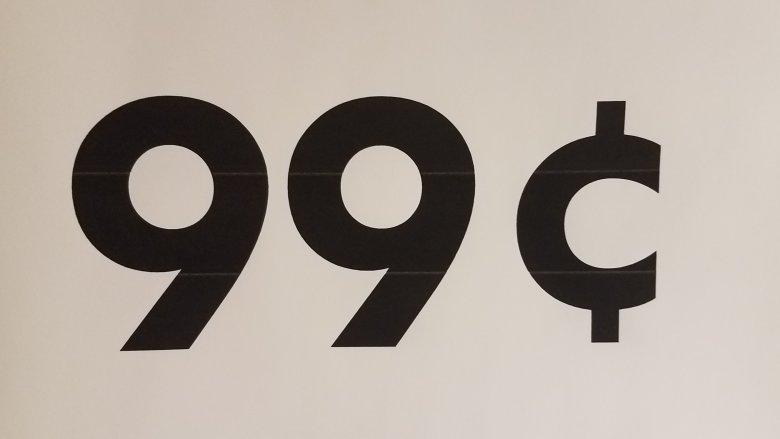
According to William Poundstone, author of Priceless: The Myth of Fair Value (via The Independent), customers are actually more willing to spend $29 on something than $25. That's because when we see something ending in a "9," we automatically think it must have been discounted from a more round number. Customers tend to believe that $29 item is actually something worth $30, and suspect $29 just sounds better. Ultimately, it makes us feel like we're getting a bargain, and who can resist a bargain? It's the same thing that's at work in a huge range of stores, and it's so common CBS News says there's even a name for it: charm pricing.
Typeface matters, too
If you've ever wondered how much typeface impacts how you feel about something, just type out the first few lines of War and Peace, format it to Comic Sans, then read it again. According to the BBC, the typeface of a menu has such a great impact it can even change how we think food tastes.
They talked to Charles Spence, a University of Oxford professor who says typeface can be utilized to guide people toward the dishes the restaurant wants them to order, and that's particularly true of dessert. He's found that when dessert menus are done in a round sort of typeface, customers are more tempted by what they perceive to be sweeter desserts. On the other hand, if the same menu is written in hard, angular fonts, that causes an association with bitterness and might completely turn a diner off from that chocolate brownie sundae.
The effect is even more drastic when it comes to wine. Swiss researchers have found that the harder to read and the more script-like the font of a wine menu is, the more customers will like the wine they order. Script conveys a sense of of elegance, and what's classier than a glass of wine?
Bigger isn't better
We might think we like having a ton of choices, but we don't — not really. It's called the "paradox of choice," and it's an idea put into words by social theorist and psychologist Barry Schwartz (via The Guardian). Simply put, it's the idea there's a tipping point where choice just becomes too much for us to handle, and instead of giving us a pleasant array of options, it starts to become unthinkably stressful.
Think about being handed a giant, 20-page menu filled with an insane amount of options. By the time you get to the end, you've forgotten half the things you looked at, order something random, and you've got a sneaking suspicion there was a better choice. Right?
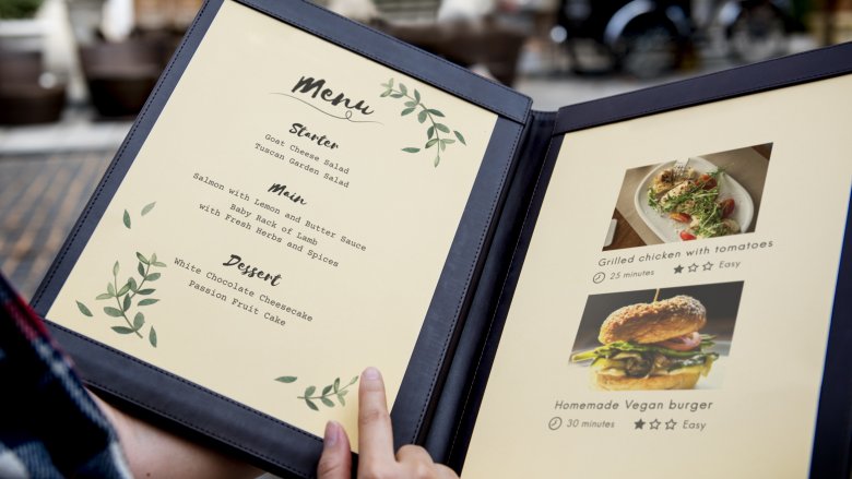
That's why most menus are broken down into easily digestible sections that include only around five to seven items. Menu engineer Gregg Rapp says (via the BBC) that more than seven items will overwhelm most customers, while less than five and it starts to feel like they're not being given enough choice. In fine dining restaurants, customers can handle between seven and ten items, but even there, menus aren't giving you more choices because restaurateurs know you can't handle it.
Pointing you in the right direction
Everyone can agree that big, red arrows pointing to menu items isn't the most discreet way to get someone to order something in particular, but there are a whole bunch of sneaky ways menus can draw your eye to a certain item. A lot of it is all down to layout.
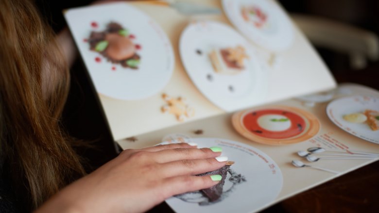
Dave Pavesic, PhD, FMP, took a look at just how important the layout of menus are, and says the menu is essentially a "silent salesperson". So, let's consider a few layout tricks. Items that have a higher profit margin are the ones that keep the doors open and the staff paid, so they're hoping you're going to order those. That's why they're the items that are separated by boxes, shaded with a different color, or described in bold type. Icons he calls "eye magnets" are used to make a dish stand out, too, and you're familiar with those. Those are the bright red hearts that proclaim something is "heart healthy," or the green check marks that advertise the chef's favorites.
This is also why some menu items are set aside on a graphic of a skillet, for example, or on the image of a cutting board. Just adding a simple border is all it takes to get a customer's attention and get them thinking they're going to order something special if they opt for this particular item, and in all fairness, they're getting exactly that.
