The Creepy Ways Restaurants Play Tricks On Your Mind
When you go into a restaurant, you know how hungry you are, what kind of things you're going to order, and about how much you're planning on spending. That's true whether it's fast food or fine dining... isn't it?
Maybe, or maybe it's complicated. There's a whole business of restaurant psychology, and it involves using things like colors, seating styles, and even music to influence the decisions customers make. If you've ever noticed things about your favorite restaurants — things like McDonald's bright colors and the classical French music played at your favorite fine dining, special occasion sort of restaurant — you've noticed some of the things put in place to get you to think and feel a certain way. That leads you to order certain things, be more willing to spend money, and eat faster (or slower) based on how fast they want to get you out the door.
Don't believe you're that easily influenced? Let's take a look at some key components in restaurant psychology, and as we do, take an honest look at your own dining habits and see if any of these have ever influenced you.
Some colors can make you hungry
Color psychology is the idea that certain colors make us feel certain ways. It's why high-energy living spaces like kitchens are often decorated in bright colors, and why rooms for relaxation — like living rooms — are often done in more muted tones.
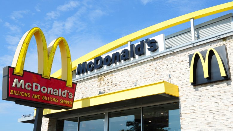
According to Business Insider, the same principles are at work in fast food logos and decor. Just think about how many use red, orange, or yellow. That's all the big ones — McDonald's, Wendy's, Burger King, KFC, Dairy Queen, Chick-fil-A... the list goes on. It's a little complicated, but we've become so used to associating these colors with fast food that we feel even hungrier when we see these bright logos. That hunger is made even stronger by a powerful association with happy childhood memories.
According to Care2, those brightly colored logos and interior decor schemes increase a person's heart rate, blood pressure, and appetite. It's linked with feelings of energy and happiness, and when customers are surrounded by it, they're going to eat faster and more than they probably expected. That means there's definitely a very clear message that's sent by those bright, cheery logos: eat, and eat lots.
Some colors keep you in your seat
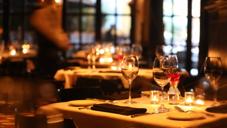
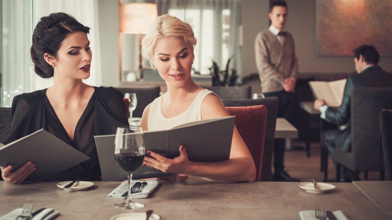
Think back to the last fine dining restaurant you were in. Chances are good it was decorated in warm, comforting colors. We're talking about dark shades of red, orange, and brown, and there probably wasn't a bright, direct light in the whole place. That's all carefully done to create an atmosphere that doesn't just seem elegant and refined, but according to The Restaurant Times, those colors also help keep you comfortable, relaxed, and eating through a series of courses. It's meant to be a cozy sort of atmosphere that will make you want to stay in your seat — not just for your meal, but for coffee and dessert afterwards. Those color schemes are going to make you more likely to agree to just one more course, to eat more, and ultimately, to spend more.
Red is a common color that pops up here, too — in many restaurants, says Fohlio. But while fast food reds are bright and energetic shades, fine dining reds are dark and earthy. Think of it this way: it's the same color as that glass of wine they're trying to get you to order. Makes sense now, doesn't it?
And some colors help you choose the salad
A new restaurant opens in town, and you can see they're decorating in colors of green, blue, and pale browns. You already know it's going to be a cafe or coffee shop with a focus on healthy, locally-sourced foods, right?
That's because those shades of green are chosen to make you think of, well, leafy greens and other kinds of uber-healthy foods. According to The Restaurant Times, there's another reason these kinds of restaurants pick these shades — they've been shown to increase a feeling of space, openness, and comfort, and that's going to keep you around longer. Fohlio adds these colors have also been shown to be mild appetite stimulants, so being surrounded by them makes it more likely customers are going to fully embrace the idea that they're eating healthy and they're going to eat more, order another coffee, justify an extra course because, well, it's healthy, right?
The seating gets you to stay… or leave
For most restaurants, every aspect of the design is carefully chosen and planned. That's true of things from the colors schemes to the layout, and even though you may have never noticed it, you've probably experienced some subliminal messages via the seating, too.
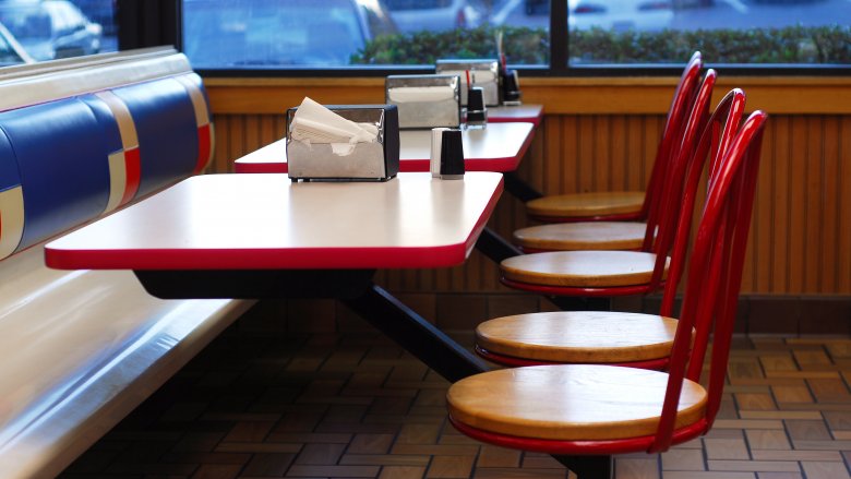
Think back to the last fast food restaurant you went to. The seats were probably plastic, and they definitely weren't comfortable. According to The Independent's interview with people who design restaurants for a living, those uncomfortable seats are there for a reason. Since fast food places want to get customers in, fed, and out, they install those plastic chairs to encourage you not to hang around. Pubs and fine dining restaurants are on the other end of the spectrum. They tend toward plush, comfortable chairs that feel so welcoming you're more likely to linger, to order a few more courses — or a few more drinks — to share with friends, and ultimately, to spend more money. You're also going to come back with a group of friends to just hang out, too, aren't you? We thought so.
It smells that way on purpose
Our sense of smell is powerful, and if you've ever caught a whiff of bread right out of oven then realized you're starving, you know there's a direct connection between our olfactory senses and our stomachs. Some restaurants are set up to capitalize on that, says Fohlio, and while your brain might never notice, your stomach certainly will.
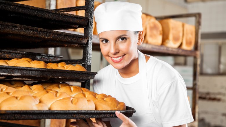
We mentioned bread, and there's a reason for that. Bakeries and cafes are the perfect example of restaurants that use smell to the utmost. Take Cinnabon. Most of their stores are laid out so the ovens are near the front, overwhelming customers as they walk in and ultimately making them hungrier — and more likely to spend some serious cash — than if it was a scent-free environment. The University of Paderborn even found out how much more: Their research shows using the right smells can increase impulse buying by six percent, length of customer stays by almost 16 percent, and food sales by up to 300 percent.
That principle is why some places — especially those that grill their own steaks and meat — opt for an open kitchen. Go on, just try ordering a salad with that smell wafting over you.
It's dark (or bright) for a reason
Raimundo Gaby is an associate professor of business management at the Culinary Institute of America, and says (via Fohlio) one of the biggest mistakes restaurants make is underestimating the effect lighting has on their customers' mood, experiences, and dining habits.
Let's take a specific example: a fine dining restaurant with low ambient lighting, and only a few brightly lit accent pieces. For starters, that's going to make it hard to see your menu, and the tendency is to lean in. That brings everyone closer together, and it also encourages intimacy, close conversation, and a prolonged dining experience. Customers feel relaxed and secure, and more likely to spend more time at the table ordering a few more courses. That works especially well during peak times, because even though you might be thinking you should rush through a busy, dinnertime service so others can grab your table, low lighting helps keep you in your seat long enough to order drinks and dessert.
Bright lighting does exactly the opposite: it keeps you alert, stimulated, and encourages fast turnovers. No one's ever going to accuse Burger King of having mood lighting, right?
The menu layout is not just for aesthetics
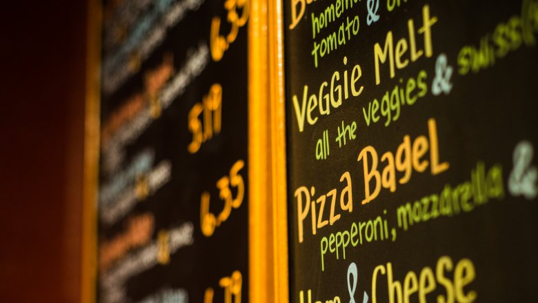
Aaron Allen & Associates is a global restaurant consulting firm, and they say there are a ton of tricks built into every restaurant's menu. Designers use things like color theory, buzzwords, and layout to guide you toward certain items. It's not at all arbitrary, either — there's been a ton of research done into menu psychology.
Let's take just one major aspect of menu design, and that's something called the Golden Triangle. Researchers have found that the first thing we look at when we glance at a menu isn't the top, it's the center. Most people then look at whatever is in the top right-hand corner, then the top left. Those three points make up the triangle, and that's why designers are careful to pick the menu items with the highest profit margins to place there. You're more likely to see them, more likely to order them, and that's better for the restaurant's bottom line.
Menu colors aren't just for looks, either
If the menu has a ton of color to it, you can be certain all those colors were carefully chosen. According to the restaurant consulting firm Aaron Allen & Associates, color is just as important to the menu as it is to the dining area.
Simple menus with only a few colors reinforce the idea you're in a classy, chic sort of place, but next time you're in a place with a colorful menu, notice what they've chosen to use. Items highlighted or written in red and yellow are the ones they want to stand out. Your eye is drawn to these, and these are probably the ones with higher profit margins. We're programmed to see red as a sort of alert — and it works. Any items they want to appear as extra-healthy options are probably green, and if you've ever wondered why many menus use orange, that's because it's been found to make you more likely to order more items.
Negative space is just as important, and if you notice a menu item set apart from the rest, it's doing exactly what they want it to. Your eye is drawn to those separate menu items, you're going to be thinking that it must be something special, and you're more likely to order it.
Music can impact your wine tastes and choices
Music at restaurants is much, much more than background noise, and even if you're not really paying attention to it, it can have a major impact on your behavior. According to Business Insider, one of the biggest ways you can see this is in restaurants that choose music with a slow tempo. That's been found to make you eat slower, but it'll also make you spend more. Classical music does much the same thing, and strangely, it's even been found to help steer customers toward more expensive dishes.
There's something else at play here, too, and researchers have even discovered that music has a pretty surprising influence over both your decision to buy wine, and your choice of wine. In one study published in the Journal of Applied Psychology (via Institut Paul Bocuse), researchers found when French music was played, more French wine was bought. The same preference showed up with German music and wine, suggesting there's something about that background music that goes right into our subconscious.
Acoustics make magic happen
You've probably been in places on both ends of this spectrum, so let's use a pub as our example. If the ambient sound is too loud, you're not going to be able to carry on a conversation with your friends, you'll have a single beer, and leave. If it's too quiet, there's an eerie vibe that it's unpopular, and everyone else is going to hear every single word you say. Neither make for the perfect night out.
There's actually a sweet spot, and according to Fohlio, restaurants and pubs can lay out their acoustics in such a way they'll end up with a background level of noise that actually makes customers drink faster, stay longer, and order more. First, a bit of a baseline. Your normal, busy office environment usually has decibel levels of around 60db (via PSU's NoiseQuest), and you can expect most restaurants to be a little louder than that, around 72 to 75db. But crank that up to between 88 and 91db, and customers will start drinking more. That's true whether it's alcoholic or non-alcoholic drinks, and now you know why your favorite local always seems like it's slightly more noisy than you're used to.
